
Nano Banana + Gemini 3: A Four-Step Workflow for UI No Coding Agent Would Design
Coding agents play it safe and every AI website ends up looking the same. An image model like Nano Banana, planned with Gemini 3, produces tilted, glassy, 3D interfaces in about 30 seconds that you can hand off as a buildable spec.

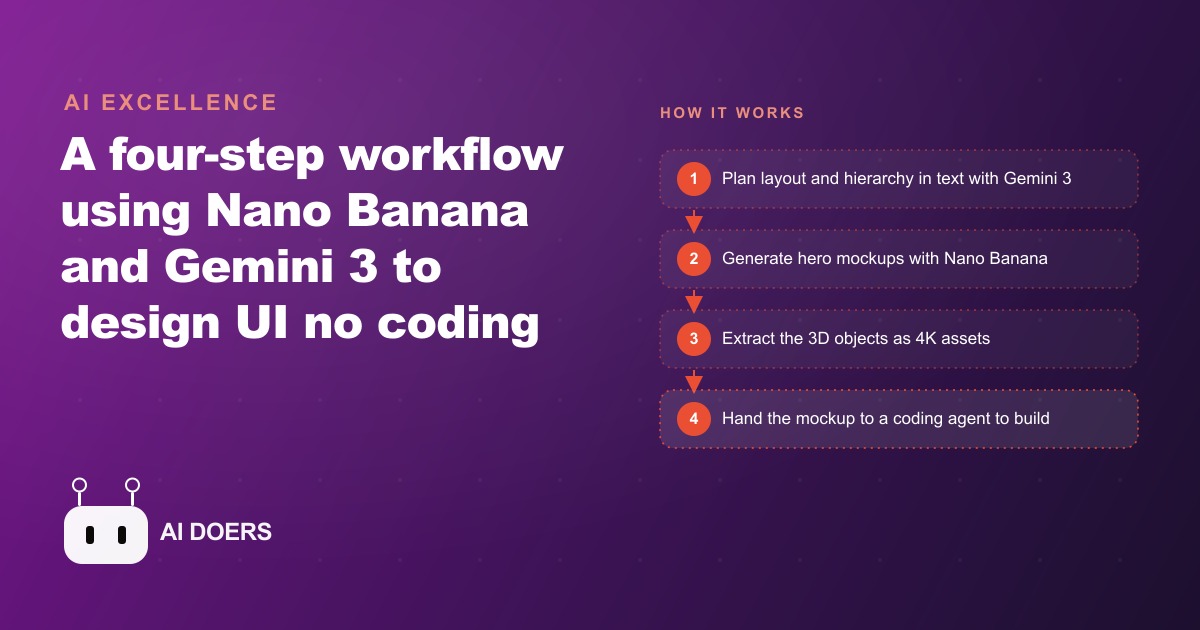
I, Madhuranjan Kumar, have watched coding agents produce the same three hero section layouts in slightly different color palettes for long enough to know the pattern is structural, not accidental. Coding agents play it safe. They are trained on code repositories where a working output is the goal, not a surprising one, and they quietly sidestep anything visually bold because bold layouts are harder to implement cleanly in code.
Nano Banana is a different kind of tool. It is an image generation model, so it does not care about implementation difficulty. It returns genuinely creative interface layouts, tilted panels, glass card stacks, floating three-dimensional product renders, ambient lighting effects that feel like a studio produced them, all in roughly 30 seconds per version. Paired with Gemini 3 for planning, this becomes a design workflow that produces interfaces coding agents would never independently propose, and it turns that creative output into something a developer can actually build from.
Align on the Design Direction in Text Before Any Pixels Are Generated
The single most common mistake in an image-model design workflow is jumping straight to generation without spending time on direction in text first. Text is the cheapest medium for exploration. A misaligned creative direction that becomes obvious after 20 image generations cost you ten minutes you did not need to spend.
The right starting point is a planning session with Gemini 3 in Google AI Studio. Gemini 3 has strong enough spatial reasoning and front-end design understanding to serve as a genuine creative director rather than just a prompt-execution engine. The session should cover layout structure, visual hierarchy, spacing philosophy, texture and material choices, background treatment, and animation intent. That is a list of things to settle in words before any image model is involved.
Bring two inputs into this planning session. First, a full-page screenshot of the current site or the closest reference for the brand, captured with a tool like GoFullPage so the entire layout is visible in one image. Second, a clear description of the product, the brand values, and the audience. Give Gemini 3 an explicit instruction to be extremely creative with structure and white space, and to propose layouts that would feel ambitious to implement. The planning output is not code or a mockup. It is a clear written description of a direction that the image model can then execute with visual freedom.
Reference images help focus the creative direction, but they need to be used within a hard limit. Pull two or three images from galleries like Dribbble, Godly, or similar sources that capture the visual feeling you are aiming for. Use images that are consistent with each other in style and visual language. If the references are wildly different from one another, the model tries to synthesize conflicting directions and produces incoherent results that look like nothing in particular. Fewer references with a consistent aesthetic give the model a clear target to move toward rather than a tug-of-war to resolve.
For a specialty coffee roaster building a new brand landing page, this planning session might land on a direction like: dark, textured background with a warm amber glow, the flagship bag floating at a slight tilt with steam rising and catching the light, generous negative space around the product, a single headline in a weighted serif font, and subtle parallax depth that suggests quality without busyness. That written direction is the creative brief the image model is executing against.
Feed Nano Banana the Right Inputs for a Creative First Pass
With the direction settled in text, switch to Nano Banana and ask for hero section UI mockups, specifically not code. The distinction matters. When you ask a model for code, it optimizes for what is straightforward to implement. When you ask for UI mockups, Nano Banana optimizes for what looks compelling, and those are often very different things.
The kind of layouts Nano Banana proposes freely, tilted card stacks, three-dimensional objects with realistic lighting, glass panels with depth and blur behind them, are layouts that coding agents avoid not because they cannot be coded but because coding them requires careful implementation that the agent would rather not plan for if there is a simpler alternative. Nano Banana has no such preference. It generates whatever looks good without regard to implementation complexity.
Bring the Gemini 3 planning output into Nano Banana as the basis for the prompt, alongside the brand reference images. Start with the hero section because that is the highest-value creative decision on any landing page. It is the first thing the visitor sees and the element that most directly signals the brand's quality level. A distinctive, well-executed hero section on a paid traffic landing page for Google Ads campaigns converts at a meaningfully higher rate than a generic one because it signals quality before the visitor has processed any copy.
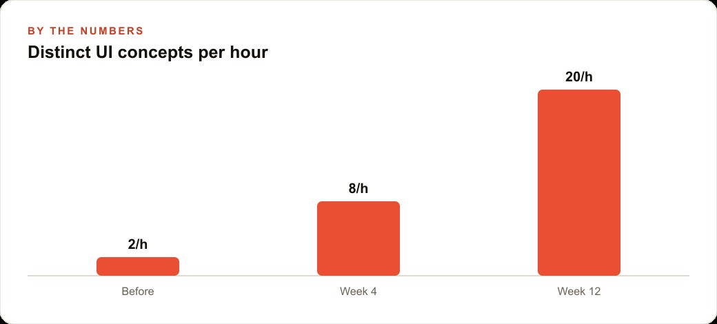
Ask for several distinct directions in the first pass rather than one. With each generation taking around 30 seconds, exploring five different creative directions costs two and a half minutes. That speed collapses the exploration phase of a design project from a multi-day design brief cycle into an afternoon. The cost of a direction that does not work is negligible, which means you can afford to try genuinely risky ideas rather than defaulting to the safe version that you know will be acceptable.
For the coffee roaster, a strong first pass might generate a version with the bag centered at a 12-degree tilt on a dark textured background with warm light catching the beans through the packaging window, another with the bag floating in a glass-surfaced scene with steam trails rendered in volumetric light, and a third with a more editorial layout with the bag anchored low-right and a large typographic treatment on the upper left. Any of those three is a visual direction a coding agent would not have proposed from a text prompt alone.
Extract the 3D Background Asset as a Clean, Buildable File
Once you have a mockup direction that captures what the final design should feel like, the next step is converting the visual into a buildable asset. The mockup itself is not the final design. It is the visual specification and the source of the hero image asset.
Paste the chosen mockup back into Nano Banana and give it a specific instruction: extract the three-dimensional objects from the mockup as a high-resolution background asset, removing the UI elements such as buttons, text, and navigation. You want the product render, the lighting environment, the background texture, and any three-dimensional scene elements delivered as a clean, standalone image file with as much resolution as the model can produce.
The reason for this separation is that UI elements, buttons, form fields, navigation, typography, are better built in code rather than baked into an image. An image-embedded button does not respond to hover states or screen size. Typography baked into a background image does not remain accessible or adjustable. By extracting the three-dimensional scene as a background asset and coding the UI layer on top of it, you get both the visual depth and richness of the generated scene and the full interactivity and responsiveness of properly built UI components.
Send the extracted asset through a background removal service like Replicate's background remover if you need the three-dimensional object separated from its generated background. This gives you a clean, transparent-background product render that can be placed on any background or used in multiple design contexts, including ad creatives for Meta campaigns where the hero asset often needs to work across multiple format variations.
For the coffee roaster, the clean extracted asset is the flagship bag rendered in three dimensions with the full lighting treatment, the warm amber glow and steam effects intact, ready to be placed into a coded hero section with a real headline, a real CTA button, and a real navigation bar that the developer builds on top of it. The visual quality comes from Nano Banana. The functional quality comes from the coded layer above it.
Hand the Mockup to the Coding Agent as a Precise Visual Specification
With a clean background asset and the full mockup image in hand, the coding agent's job changes from creative invention to precise replication. That is a significantly easier task, and the quality of output reflects it. A coding agent given a clear visual target and a high-resolution asset to work with produces results that match the intent. A coding agent given only a text description of what the design should feel like produces the safe version of whatever it can approximate.
Before asking the coding agent to start building, ask it to analyze the design first. Share the mockup image and ask the agent to identify the hard parts of the implementation, the elements that require careful planning or specific techniques, and to describe an approach for each one before writing a single line of code. This planning step surfaces the implementation decisions early, when changing course is cheap, rather than mid-build when the structure is already established.
The analysis might reveal that the tilted card effect requires a CSS transform with a specific perspective value, that the glass panel needs a backdrop-filter blur with a specific intensity, or that the ambient background glow works best as an SVG gradient rather than a CSS one because of browser rendering differences. Each of those is a decision better made before the build starts, and the agent's planning response tells you whether its approach is going to produce the right result or approximate it poorly.
Switch to build mode after the planning analysis is approved. Give the agent the full mockup as the visual target, the clean background asset as a buildable file, and the implementation plan as the build spec. Ask for a pixel-precise implementation against the mockup. The specificity of that instruction matters: pixel-precise gives the agent a clear quality bar to meet rather than a vague direction to interpret.
Illustratively, a landing page built through this workflow for a specialty food brand typically takes one afternoon to reach a first build that is 80 to 90 percent of the way to the final design. The remaining iteration is the small-correction phase rather than a fundamental rebuild, which is where most of the time savings versus traditional design-then-build workflows comes from. These estimates vary by project complexity and the specific coding agent used, but the directional result of having a precise visual specification is consistently faster implementation with fewer misaligned revision rounds.
Iterate With Small Corrections Instead of Starting Over
The moment where most people lose time in an image-model design workflow is when they get to 80 percent of the right result and delete everything to start fresh instead of prompting the specific correction they need.
Nano Banana is strong at targeted editing when the input is already close to what you want. If the version you have is right except that the product is slightly too centered and the steam effect is too prominent, say exactly that in the next prompt: move the product to the right third of the frame and reduce the steam opacity by half. That targeted correction produces a much better result than regenerating from a different angle because the model preserves the parts of the scene that were already working while adjusting the specific elements you named.
Logo drift is a specific trap in multi-session design work. Gemini 3 pays the most attention to the most recently submitted image in its context. Across a long planning or iteration session, if you have submitted many different reference images, the model may gradually drift away from the official logo or wordmark, substituting visual elements that are similar in shape but not identical. The fix is simple: paste the official logo back into the prompt explicitly, state that the mockup ratio should remain the same, and instruct the model to use the official version from that point forward. This resets the model's attention to the correct brand element without requiring you to restart the session.
A useful final step before handing the design to a developer is to ask Gemini 3 to review the fully built implementation against the original mockup and produce an annotated list of differences and improvement suggestions. Format the request so the output comes back as a list of specific, actionable tickets, each describing what needs to change and why. Those tickets go directly back to the coding agent, creating a closed feedback loop that compresses the design review cycle without requiring a human designer to sit in the room.
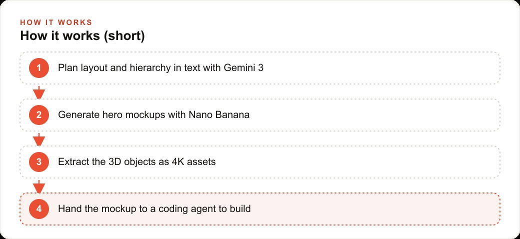
The workflow as a whole, planning in text, generating with Nano Banana, extracting clean assets, handing a precise specification to a coding agent, and iterating with targeted corrections, produces a different category of visual output than any single tool in that chain would produce on its own. Coding agents produce what is implementable. Image models produce what looks good. The workflow combines both by using each tool at the stage it is actually optimized for.
That is exactly what we do at AI DOERS. Book a private 30-minute call with Madhuranjan Kumar and we will map the fastest path to it for your specific business.
Book your call →
Madhuranjan Kumar
Madhuranjan Kumar brings 20 years of performance-marketing experience and has managed over $200 million in Facebook ad spend for brands across the United States and beyond. His expertise spans the full modern marketing stack: Meta, Google Ads, TikTok, email automation, CRM, and the websites that hold it together. At AI DOERS he turns that track record into lead-generation systems for businesses across every industry.