
How to Turn a Vibe-Coded Web App Into a Shipped iOS App Without Writing Code
You rebuild a web app's features as a mobile app on a vibe-coding platform using Claude Opus 4.5, add a cloud database and sign-in through plain-English prompts, then publish to the App Store with an Apple developer account and a free Expo account, all without hand-writing code.

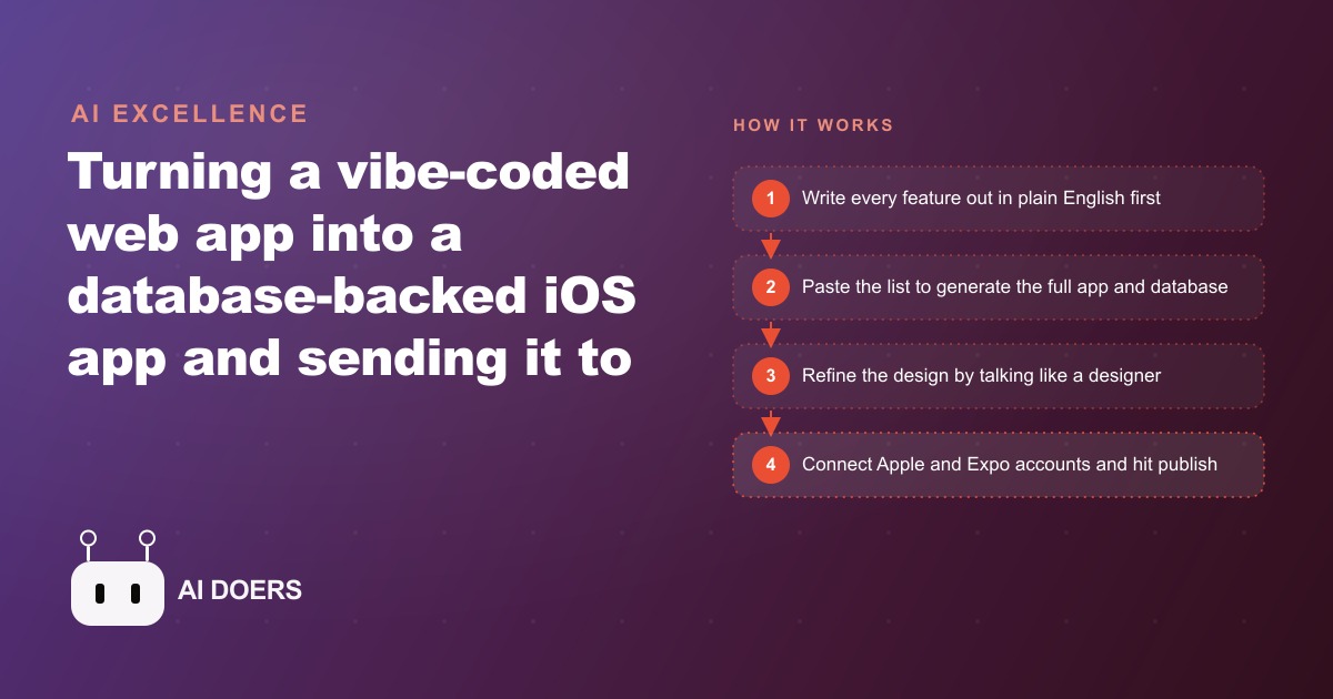
An iOS app shipped to the App Store without a single line of hand-written code, and the barrier that kept most small businesses off mobile disappeared with it.
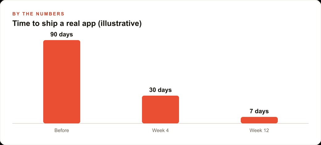
The specific moment that made this real was not a product announcement or a benchmark result. It was the submission confirmation: a working app, built entirely through plain-English descriptions, sitting in TestFlight and ready for review before going public. The process used a vibe-coding platform to rebuild an existing web app as a full mobile application. It added a cloud database, wired in sign-in, refined the design through conversation, and submitted to Apple. The total cost to reach that confirmation sits under five hundred dollars for the first year. The comparison development contract for the same feature set starts at twelve thousand dollars and delivers in three to six months.
The hard part of building a mobile app was never the code. It was always describing clearly what the app should do, who it should do it for, and what should happen at each step of the user's path. That description is now the entire job. Everything else runs automatically.
The App Store Barrier Just Collapsed for Businesses Without a Developer
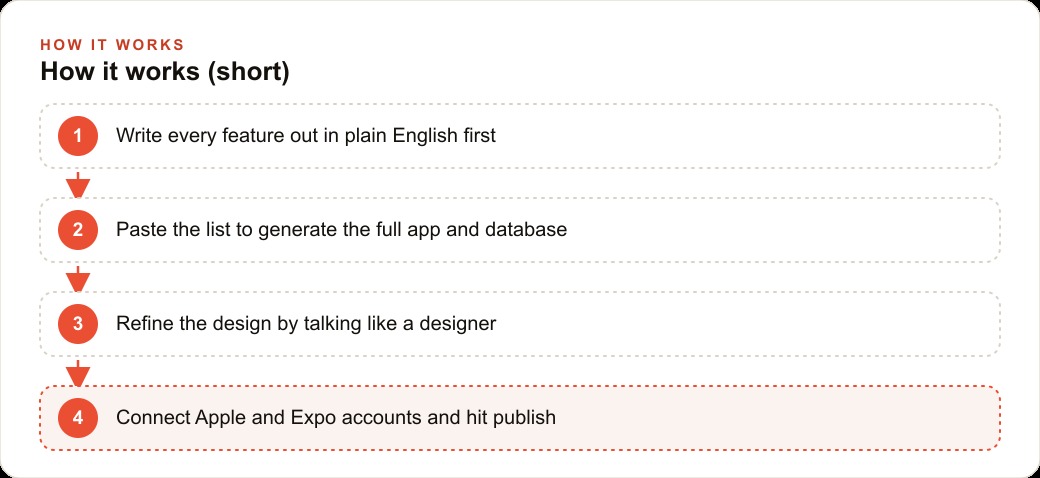
The starting point for this build was a simple theme-browser website that copied a prompt to the clipboard. The web version worked but felt unfinished: sparse layout, no visual hierarchy, no account system, no sense that a real product was behind it. Rather than spending weeks refining the website, the decision was to rebuild it as a phone app. The first action was not technical. Every feature was written out in plain English before a single build tool was opened.
The list looked like this: a phone mockup view that shows themes as they would appear on a real device screen, a browsable grid of available themes, a tap-to-preview interaction, a one-tap copy function, and a copy counter that writes to a database so popular themes surface over time. That list became the build prompt. Pasted into a vibe-coding platform with the cloud database option enabled, it produced a working front end, a configured database with tables and schema, and a sign-in page, all in a few minutes, with no code written by hand at any stage.
What the platform produces is not a website displayed inside an app frame. It generates real mobile application code built on the same frameworks professional developers use. The code runs natively on iPhone, connects to a cloud database, handles authentication, and is structured in a way a developer can read and extend later. For simple tools and utilities, that output is sufficient for a first version that real users can download and use from the App Store.
Service Businesses Without a Dev Team Gain the Most From This Shift
The businesses that benefit most from this change are the ones that had the clearest need for a mobile presence but the smallest margin for a development contract. Service businesses sit squarely in this category. A hair salon that wants clients to rebook through a branded app rather than calling the front desk. A personal trainer who wants clients to log workouts and track sessions in an app the trainer controls rather than a shared spreadsheet. A catering company that wants corporate clients to place standing orders from a mobile interface. A cleaning service that wants customers to schedule and confirm appointments without a phone call. Each of these is a well-defined use case that benefits from mobile access and does not require complex real-time features, hardware integrations, or enterprise-grade security to deliver real value.
The profile that fits this moment best is any service business with a defined, repeating customer interaction that currently happens over the phone or through a generic third-party booking page. Moving that interaction into a branded app improves the experience, increases rebooking rates, and gives the business its own channel rather than depending on a platform it does not control. Building that app used to require hiring a developer. It now requires a well-written feature list and an afternoon.
The honest limit is that apps built this way are designed as first versions. They are not enterprise-grade and are not built to handle complex real-time features at scale. They are market tests: minimum investment to find out whether users will adopt the app and whether the idea justifies further investment. A business that spends three to five hundred dollars to find out the concept works has bought that answer at a price that changes how freely they can test ideas.
The Concrete Move Is to Write a Complete Feature List Before Opening Any Build Tool
The most important step in this entire process costs nothing and requires no technical knowledge. Write out every feature the app needs in plain English before opening any build tool. Not a rough sketch. A complete list: every screen, every user action, what happens after each action, and what information the app needs to remember. The list does not need to use technical language. It needs to be specific.
A vague prompt produces a vague app. Telling a platform to build a booking app requires it to guess every dimension of what that means and produces something generic that takes more time to fix than a clear spec would have prevented. Writing the full feature list before starting is the investment that determines how close the first version comes to the actual goal.
The design refinement phase runs the same way. Each of these instructions produces a visible, immediate change: make the phone mockup taller and match the proportions of a real iPhone screen, shrink the text inside the mockup so it reads like an actual app rather than a scaled-up website, make the theme cards larger and center them below the phone display, add a cleaner copy label and a more readable icon on the copy button. When something looks visually wrong on screen, the fastest fix is to paste a screenshot into the conversation with a short note. The model reads the image and corrects the layout more reliably than a paragraph of text trying to describe what needs to change. Between major feature additions, clearing the chat history before starting the next task keeps the model focused on new work rather than trying to reconcile every previous instruction simultaneously.
The Bakery Pre-Order Example Shows How This Plays Out With Real Numbers
A bakery building a pre-order and pickup app using this process would start with a feature list written before any tool is opened. The list reads: a menu page showing daily items with photos and prices, an item detail view with ingredient notes and allergy callouts, a pickup time selector showing available slots for the day, a cart with a running total, a checkout step that collects a name and phone number and takes a small deposit to confirm the order, and a confirmation screen with the full order summary and pickup instructions. That list becomes the build prompt.
The platform generates the front end and a cloud database that holds menu items, order records, and pickup slot availability. The database earns its place immediately because every completed order becomes a row the bakery can read: which items sell by time of day, which pickup slots fill first, which days have the most demand, which items regularly appear together in the same order. That data replaces morning guesswork with information from the previous week's actual behavior.
Sign-in at checkout captures each customer's contact information at the moment they are most engaged. A name and phone number collected through a quick sign-up step at the moment of first order becomes the bakery's own customer list, usable for advance announcements of seasonal items and limited-run specials. The design refinement focuses on warmth and clarity: larger product images, better font weight on item names, a clearly labeled deposit amount that tells customers exactly what they are committing to, and a confirmation message that is friendly rather than administrative.
Apple developer account: ninety-nine dollars per year. Platform subscription at a mid-tier plan: roughly thirty to forty dollars per month. First-year total: approximately four hundred fifty to five hundred eighty dollars, plus whatever time the owner invests in the feature list and the design iteration. The alternative development contract for the same feature set, a database-backed mobile app with sign-in and order management, starts at twelve thousand to fifteen thousand dollars and typically delivers in three to five months. At under six hundred dollars, the bakery has a real app in the App Store before its peak season, has built its own customer contact list through the sign-up gate, and has actual order data from real customers to inform the second version. That is the full ROI case and it rests entirely on the cost of describing the features clearly before the build began.
The Cost Comparison Makes a Traditional Dev Contract Hard to Justify for a First Version
The framing that matters here is not whether the vibe-coded app matches the quality of a professionally developed one. It does not, and that is not the point. The framing is: what is the right amount to spend to find out whether an idea works before committing to a production-quality version?
A traditional development contract is a capital commitment. It is paid before a single user touches the app. The business is betting fifteen to fifty thousand dollars on its assumption about what users want. If the assumption is correct, the investment pays off. If the assumption is wrong, or if the users want a meaningfully different version of the same idea, the business has spent its development budget discovering that fact.
A vibe-coded first version is priced as an experiment. At three hundred to seven hundred dollars for the first year, the business is paying to find out. If users adopt the app and the core concept proves itself with real usage data, the case for a more polished second version is now backed by evidence rather than assumption. If the concept needs rethinking, the cost of that discovery is small enough that the remaining budget can go toward a better idea. The first version is not the finished product. It is the research that justifies the finished product, priced accordingly.
What This Means for Any Business That Shelved a Mobile Idea Because of Cost
Every business that once received a development quote and decided the number was too high for the uncertainty involved is now in a different position. The uncertainty is the same. The cost of resolving it dropped by ninety to ninety-five percent. That changes which ideas are worth testing and how freely a business can iterate when the first version teaches them something unexpected.
The pattern for using this correctly is straightforward. Write a complete feature list before opening any build tool. Use screenshot annotations rather than paragraphs to describe visual problems. Clear the chat context between major feature additions. Gate the core value action behind sign-in from day one so the customer list grows with the app. Submit to TestFlight, collect feedback from real users, and use what they do rather than what they say to decide what the second version should change.
The only remaining barrier to a business having its own mobile presence is the quality of its description of what that presence should do. That is a barrier built from knowledge of the customer, not from technical skill, and it is lower and more equitable than any of the barriers it replaced.
The practical follow-through is one week of work. Spend the first hour writing the feature list. Spend the next afternoon in the build tool, starting with planning mode on, reviewing the plan, and letting the agent build and self-test. Spend a day on design refinement through follow-up prompts, using annotated screenshots to fix anything that looks wrong on a real phone screen. Connect the Apple developer account and a free Expo account, generate an icon, and submit to TestFlight. The first real-user feedback arrives within days rather than months. That feedback is the most valuable output of the whole process, not the app itself but what real users reveal about what they actually needed versus what was assumed. Building cheaply and learning early is the correct first move. Scaling it up once the learning confirms the idea is the second move, and it is one the first version makes possible.
That is exactly what we do at AI DOERS. Book a private 30-minute call with Madhuranjan Kumar and we will map the fastest path to it for your specific business.
Book your call →
Madhuranjan Kumar
Madhuranjan Kumar brings 20 years of performance-marketing experience and has managed over $200 million in Facebook ad spend for brands across the United States and beyond. His expertise spans the full modern marketing stack: Meta, Google Ads, TikTok, email automation, CRM, and the websites that hold it together. At AI DOERS he turns that track record into lead-generation systems for businesses across every industry.