
How to Make Professional Infographics Free With NotebookLM
NotebookLM generates professional infographics at no cost, but because everyone has the same tool, the difference comes from grounding it on real sources, choosing the right detail level and style, and writing your own style description with a reusable prompt formula.

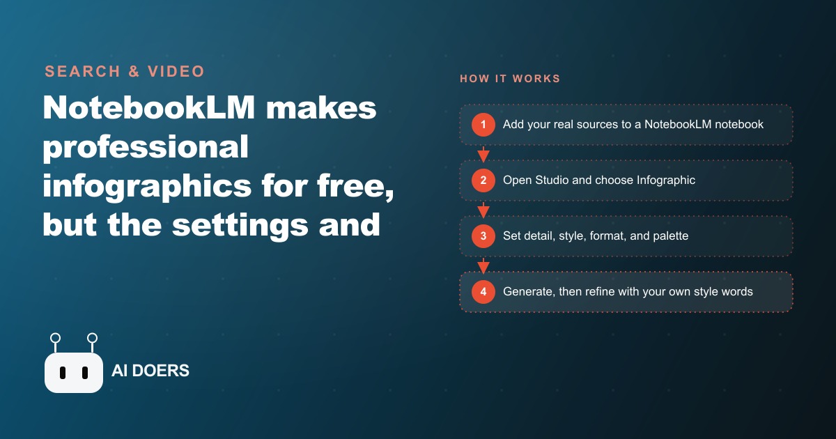
Assemble your source material before anything else
The single most common reason a NotebookLM infographic comes out generic is not the style settings or the format choice. It is the absence of good source material before anything else happens.
NotebookLM is grounded only on the sources you provide. A general chatbot pulls from the open web and answers from whatever it finds. NotebookLM works strictly from what you give it, and that design choice is the real advantage. When your notebook is grounded on your own service descriptions, your own client FAQ, your own process notes, every graphic it produces reflects your specific expertise and your real voice. But it only works that way if you give it genuinely specific, personal material to work from.
Before you open a notebook, gather what you actually know. That means your service descriptions written in your own words, your FAQ answers, guides or instruction sheets you share with clients, notes from real client conversations, and at minimum one substantial piece of writing that represents how you talk about your area of expertise. Three to five solid sources is a good practical starting set. You can add PDFs directly, paste in web links, drop in audio or video links, or upload plain documents. Each source type is accepted.
Once your personal sources are loaded, you can optionally run a research pass inside NotebookLM to supplement them with external material. There are two modes. Fast research is a quick web search that returns a handful of sources in seconds. It is useful when you want one or two external data points to support something you already know from your own experience. Deep research takes roughly ten minutes and produces a far more thorough sweep of available sources, then presents them to you for selection so you can import only the ones genuinely worth having. Choose deep research when you need external statistics, published references, or authoritative data. Choose your own documents when the graphic is about your own expertise and your own service.
The rule that matters here is selectivity. Do not import every source the research finds just because it appeared. A notebook with five focused, high-quality sources produces better output than one with twenty overlapping or thin ones. Review what the research finds, import the three or four most relevant results, and leave the rest out. Quality of inputs is the strongest lever you have on quality of output.
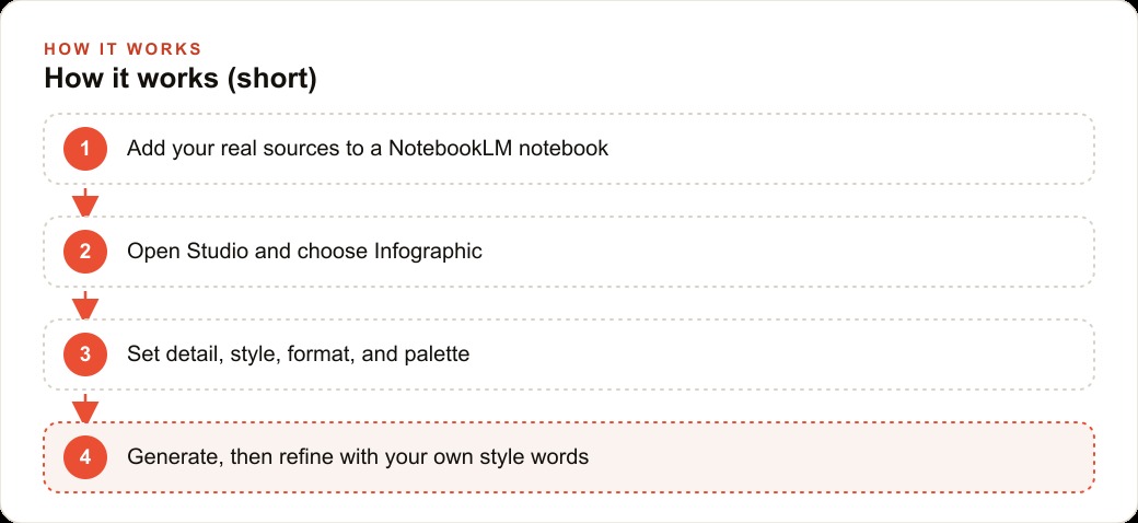
Decide between fast and deep research based on what you already have loaded
Once your core personal sources are in place, you face a practical choice about whether to supplement them with external material and if so how thoroughly. This choice matters because it directly affects generation time and the specificity of the output.
If the graphic is about something you know well and your own documents already cover it thoroughly, skip the research entirely. Your own material is the right source and adding external content will dilute rather than strengthen the focus. If the graphic needs to reference external data, a published statistic, or an authoritative source to make the argument land, run deep research and let it find supporting material for you.
When deep research finishes, read through what it surfaced before importing anything. Look for sources that are authoritative, specific, and current. Pass on sources that are thin, that duplicate something you already have loaded, or that are so broad they will pull the graphic's focus away from the specific point you want to make. Treating source selection as an editorial step, not a checkbox, is what separates people who get great output from those who wonder why the tool keeps producing something generic.
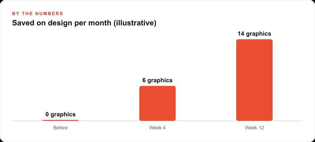
Set detail level before you think about visual style
When you open Studio and click Infographic, the first control you face is detail level: concise, standard, or detailed. Most users click past this quickly to get to the more obviously creative visual choices. That is a mistake, because detail level determines how much text appears in the graphic and therefore whether the graphic can actually be used for its intended purpose regardless of how good it looks.
Concise is right for anything that will be viewed quickly: a social media post, an Instagram carousel card, a printout at a front desk, a slide thumbnail. The text stays minimal and the design breathes. If a viewer will spend three seconds on your graphic before scrolling past, concise is the only setting that works. Standard adds more depth and suits email graphics, blog embeds, or printed materials where the reader is slightly more engaged and has a few extra seconds. Detailed packs in the most content with smaller type and is appropriate for dense reference material someone will consult repeatedly, like a workflow cheat sheet or a comprehensive service comparison chart.
The diagnostic question before you click is: how many seconds will a typical reader spend with this graphic, and on what surface? The answer tells you the detail level, and the detail level determines whether the rest of your choices matter. A concise infographic generated on the detailed setting is unreadable on a phone. A detailed infographic on the concise setting is missing most of the information that makes it useful. Set this first, then move on to style.
Write your own style description instead of relying on the built-in presets
This is where professional output diverges from ordinary output, and the gap is larger than most users expect.
NotebookLM ships with ten built-in style presets: sketch notes, kawaii, professional, scientific, anime, clay, editorial, educational, bento grid, and brick. Each one transforms the visual identity of the output completely. They are useful as starting points. The problem is that every other NotebookLM user has access to the same ten presets. The professional preset in particular is so widely used that anyone who has seen several NotebookLM graphics will recognize it on sight. It looks like everyone else's work because it was made with everyone else's starting point.
The style description box is the control most users walk past entirely, and it is the most powerful one available. It is a free-text field where you describe the look you want in your own words. Because your description is specific to you, the output it produces is specific to you. Nobody else is typing your exact description, which means the graphic genuinely looks different from anything the presets produce on their own.
The range of styles you can describe is far wider than the preset list. Beyond the ten presets you can write minimalistic, modern corporate, vintage retro, futuristic tech, cyberpunk neon, vaporwave, legendary quest, soft editorial, brutalist, or mid-century modern. You can combine terms: soft modern editorial with warm neutral tones and generous white space, or bold futuristic tech with dark backgrounds and bright accent colors, or clean educational with subtle hand-drawn detail and muted earthy tones. Each combination reshapes the entire visual system including type treatment, spatial arrangement, and color distribution.
Write your custom style description before selecting a preset. The two layers interact, with your description adding specificity on top of whatever structural preset you choose. A two-to-four sentence description naming the visual feeling you want, the typography mood, and any brand-relevant texture gives far more precise output than a single word. Once you find a combination that produces graphics matching your brand, save it and reuse it for every graphic you make. That repetition is what builds a consistent visual library rather than a collection of unrelated one-offs.
Pick the format that matches how your reader will actually use the graphic
Style is how the graphic looks. Format is what the graphic does. They are entirely separate choices, and matching the format to the content type is what makes the output genuinely functional rather than just attractive.
The formats available include roadmap, timeline, step-by-step guide, checklist, cheat sheet, comparison chart, process flow, and decision tree. Each one imposes a different structure on the same underlying content. The wrong structure makes a graphic harder to use even when the content is excellent.
A checklist is right when the reader needs to confirm they have completed each item in a set. A timeline is right when both the sequence and the spacing between events matter. A step-by-step guide works when order matters but time intervals do not. A comparison chart is the right choice when the reader needs to evaluate two or more options against the same criteria side by side. A decision tree works when the reader's path through the content changes based on their answer to a yes or no question at each stage. A process flow shows how inputs move through a system to produce outputs.
The question to ask before writing the rest of the prompt is: what will a reader do with this graphic? If they are checking things off, it is a checklist. If they are comparing options, it is a comparison chart. If their path through the content depends on their own situation, it is a decision tree. Answering that question first saves a full round of regeneration when you find after the fact that the layout does not fit the content.
Lock your color palette with hex codes before generating
Color is where professional and amateur output diverge most visibly, and the difference comes almost entirely from how the palette is specified in the prompt.
Naming colors by feel, such as warm orange or deep blue, produces inconsistent results because the generation system interprets those descriptions differently across different runs. The output might be coral one time and saffron the next, which makes it impossible to build a visually consistent library. Hex codes are exact. A specific hex code produces the same color every time, regardless of anything else.
The free tool Coolors is the fastest way to work with hex codes. You can input your existing brand colors to confirm their exact values, browse curated palettes if you are still building your visual identity, or generate complementary palettes from a seed color in seconds. Pull the hex codes for your primary color, your accent color, your background, and your text color. Drop all four directly into the color specification of your prompt.
The format that works cleanly is explicit: primary color followed by the hex code, accent followed by the hex code, background and text the same way. That specificity tells the generation system exactly what you want and produces output that matches your brand guide rather than approximating it in a direction you then have to correct. For a business with an established visual identity, this is the step that makes the output feel like it came from a real design system.
One thing to check before generating: contrast. The graphic must be readable in the environment where it will appear. Dark text on a light background and light text on a dark background both work reliably. Low-contrast combinations like warm tan text on a cream background produce graphics where the content is technically present but difficult to read in practice. If your palette includes any low-contrast pairings, note in your style description that you need strong text contrast and the system will accommodate that.
Turn a single section of a long source into a focused independent source
When your notebook contains several sources and you want a graphic specifically about one of them, the other sources can dilute the focus. The output becomes an average across everything in the notebook rather than a sharp expression of the specific thing you wanted to say.
The technique for fixing this is underused and highly effective. Open the source panel, find the source you want to focus on, and pull out the specific relevant section by selecting the text and converting it into a note. Notes in NotebookLM are editable: you can clean up the language, remove sections not relevant to this particular graphic, add context in your own words, and tighten the framing. Once the note is exactly what you want, convert it into a new independent source. Then deselect all your other sources in the panel, leaving only that new source active. Build the infographic from that single focused source.
The result is a graphic built from exactly the content you specified, with no dilution from the rest of the notebook. For a business covering multiple services, this means you can build a sharp, focused graphic for each individual service from the same notebook without every graphic trying to represent everything. For a content creator building a series of infographics from one long guide, this is how you produce each individual piece without it trying to summarize the whole document every time.
Work in batches across sessions and save what works before you close
The practical constraint of NotebookLM, even on the paid tier, is that daily generation limits are real. Attempting to build a large library of graphics in a single sitting will hit the limit before you finish. Session batching is the answer: generate a focused set of graphics per session, review them carefully, note what to change, and carry those notes into the next session as a prompt refinement.
A productive batch is three to five graphics. That is enough to see whether your style description and format choices are producing what you want, but not so many that you are rushing the review step to keep generating. After each batch, compare the outputs, identify which combination of style description and format produced the sharpest result, and note specifically what to adjust in the next session.
To put numbers to it: a hair salon building an aftercare library for four service categories, in two formats each (a concise Instagram card and a standard front-desk printout), needs eight graphics. Attempting all eight in one afternoon risks hitting the daily limit and creates pressure to skip the review step that improves quality. Two sessions of four, with a review between them, produces cleaner and more consistent results and fits comfortably within the daily limits.
Before you close each session, save your exact working style description, your hex codes, and the format choices that produced the best output in that session. Starting the next session from that saved prompt means the second batch looks like the first batch. Consistency across sessions is what turns a series of individual graphics into a library with a unified visual identity.
A complete run-through: aftercare card for a hair salon
A hair salon owner wants an aftercare guide for color clients that is postable on Instagram and printable at the front desk. Here is how the full workflow runs in one afternoon.
She starts with three sources: her own aftercare guide document, a short note in her own words about how she talks to color clients, and a list of the specific products she recommends by name. The product names matter because they make the output specific to her business rather than generic industry advice any competitor could use. No external research is needed because the content is her own expertise.
She opens Studio, clicks Infographic, and sets detail level to concise because this is going on Instagram where three seconds is a long view. She writes her own style description rather than picking a preset: soft modern editorial with warm neutral tones, generous white space, and clean sans-serif typography. She chooses a checklist format because the purpose of the card is for clients to confirm they have followed each aftercare step. For color she inputs her brand hex codes directly, the four values from her brand guide, rather than naming colors in words.
The first generation takes about thirty seconds. The output is a clean, warm graphic using her product names, her voice, and her actual recommendations. She reviews it, notes that one section has slightly more text than an Instagram card needs, adjusts the style description to add minimal text per section, and generates a second version. That second version is the printout, so she changes the detail level to standard before generating.
Two usable, on-brand graphics in under an hour from opening the tool. Both use her real content. Both match her visual identity. Both are ready to post or print without further editing. Run at that pace two or three times a week, the library builds across a month without significant time investment and without a design budget.
That is exactly what we do at AI DOERS. Book a private 30-minute call with Madhuranjan Kumar and we will map the fastest path to it for your specific business.
Book your call →
Madhuranjan Kumar
Madhuranjan Kumar brings 20 years of performance-marketing experience and has managed over $200 million in Facebook ad spend for brands across the United States and beyond. His expertise spans the full modern marketing stack: Meta, Google Ads, TikTok, email automation, CRM, and the websites that hold it together. At AI DOERS he turns that track record into lead-generation systems for businesses across every industry.