
How Claude Design Builds an Entire Brand From Plain Language
Claude Design is a separate Anthropic product, launched April 17, 2026 and powered by the Opus 4.7 vision model, that turns natural language into branded pitch decks, websites, prototypes, and videos, all kept consistent by one shared design system you build first.
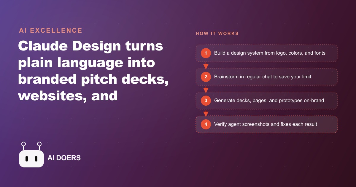
I am Madhuranjan Kumar, and the question owners ask me most is how to get a polished, consistent brand without hiring a full design team. Claude Design is one of the more interesting answers I have seen. It is a separate product inside the Anthropic ecosystem, sitting alongside Claude chat, Cowork, and Claude Code, and it launched on April 17, 2026, a day after Opus 4.7, built specifically for visual work: websites, slide decks, prototypes, even animations and short video. Plenty of people called it a Figma killer on day one. Rather than review it in the abstract, here are ten concrete things that actually determine whether it saves you time or quietly burns your budget, drawn from how I would put it to work for a real business.
1. It uses its own eyes to catch its own mistakes
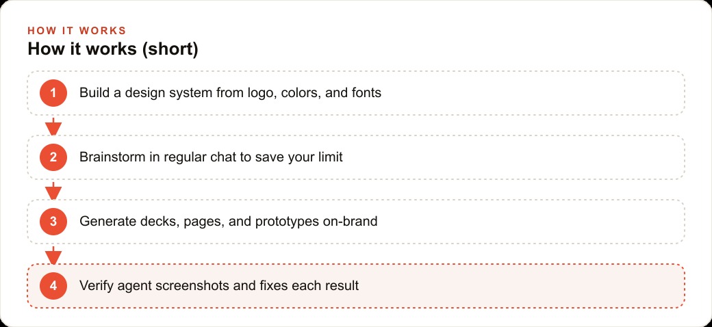
What separates Claude Design from a normal model is vision. Opus 4.7 powers it, and the tool literally looks at the page to check it did not mess anything up. A verify agent screenshots each slide or section, inspects it, and fixes what looks wrong before you ever review it. Owners underestimate how much this matters, because it means fewer rounds of you spotting the same broken layout the model could have caught itself. It is the closest thing to a designer proofreading their own work before handing it to you.
2. Build the design system before you build anything else
This is the single most important habit, and skipping it is the most common mistake. Feed it a logo, your colors, your fonts, and an existing site, and it produces a reusable spec. After that, every asset you create inherits the same branding automatically. Build the system first and a deck, a landing page, a prototype, and a promo card all come out on-brand without you re-specifying the look each time. Build assets first without a system and you spend the rest of the project fixing inconsistencies by hand.
3. One system feeds every format you need
From a single design system you can build a pitch deck, a product landing page, a mobile app prototype, and a launch video, and every piece stays consistent. That range is the real argument for a small business, because consistency across formats is exactly what makes a company look established and trustworthy before a customer reads a single word. The brand that looks the same on the website, the deck, and the social graphic reads as a real company, not a side project.
4. Brainstorm in regular chat, never in Design
Claude Design has its own usage limit, separate from regular Claude, and this trips up almost everyone at first. So you brainstorm in regular chat, where usage is cheaper, and reserve Design strictly for building, never for thinking out loud. Do all the ideation, the messaging, the deck narrative, in normal Claude, then bring only the finished plan across. In the course walkthrough, creating the design system alone used about six percent of a Max session, which is exactly why being selective about what you spend Design's limit on matters so much.
5. Use the expensive model only where it pays
Be deliberate about which model does which job. Use Opus 4.7 for planning and the heavy first build, where its judgment and vision earn their cost, then drop to Sonnet or Haiku for small tweaks to stretch your limit much farther. Treating every edit as a job for the top model is how people burn through their allotment in an afternoon. Matching the model to the size of the task is the difference between a tool you use all month and one you exhaust by the tenth.
6. Edit precisely instead of re-prompting
Editing is where you save the most tokens, and most people do it the expensive way. Instead of re-writing a long plain-language instruction, click an element to edit it precisely, circle something and describe the change in a drawn note, or open the tweaks panel and flip toggles. All three cost fewer tokens than a paragraph of instructions, and they are usually more accurate too, because you are pointing at the exact thing you mean rather than describing it and hoping.
7. A single markdown file is enough to one-shot a strong result
You do not need a whole code base or a mountain of assets to get something good. A single brand-concept markdown file with the mission, colors, and typography is enough to one-shot a strong site. That lowers the barrier dramatically for a small business, because writing one clear page about who you are and what you look like is a task any owner can do in an evening, and it gives the tool everything it needs to produce something on-brand.
8. Watch the logo, because that is the known weak spot
Here is the flaw to plan around. Claude Design has historically redrawn uploaded logos instead of keeping them exact, and a slightly wrong logo undoes the premium feel instantly. Tell it plainly to use the PNG as is, and reject any version that alters the mark. This is the one place I would not trust the verify agent blindly, because a redrawn logo can look intentional even when it is wrong. Supply a clean PNG, demand it be used unchanged, and inspect every output for it.
9. Wireframe only when the scope earns it
Wireframing is worth the spend on a whole funnel or an app layout, where getting the structure right first saves a lot of rework. For a single landing page, it is usually better to skip straight to high fidelity, because the wireframe step costs limit you could have spent on the finished thing. Knowing when to wireframe and when to jump ahead is a small judgment call that adds up across a project, and it is exactly the kind of thing that separates an efficient run from a wasteful one.
10. Export it, because a brand you cannot move is a brand you do not own
When the work is done, the design system is not locked inside the app. It exports as a ZIP, PDF, or HTML, or straight into Claude Code, and you can hand it to Canva or an image model so the same look follows the brand everywhere it shows up. That portability is the difference between a brand that lives in one expensive tool and a brand you actually own and can carry anywhere, which for an owner is the whole point.
Putting the ten together: a med spa
Here is how the list comes to life for a med spa that wants to look premium across a website, a treatment menu, seasonal promo graphics, and an investor one-pager for a second location. First, build the design system from the spa's logo, its soft palette, and its existing site, so the brand is locked in one place before anything else gets made. Then generate each asset from that system: a clean booking landing page, a polished service menu, a set of on-brand promo cards for a holiday offer, and a tidy pitch deck for the expansion, all sharing the same look. Do the brainstorming for the promo themes and the deck story in regular chat first, then bring only the finished plan into Design to protect the limit. Guard the logo, skip wireframing for the single landing page but wireframe the whole booking funnel, and export the finished system so it can flow into the rest of the marketing.
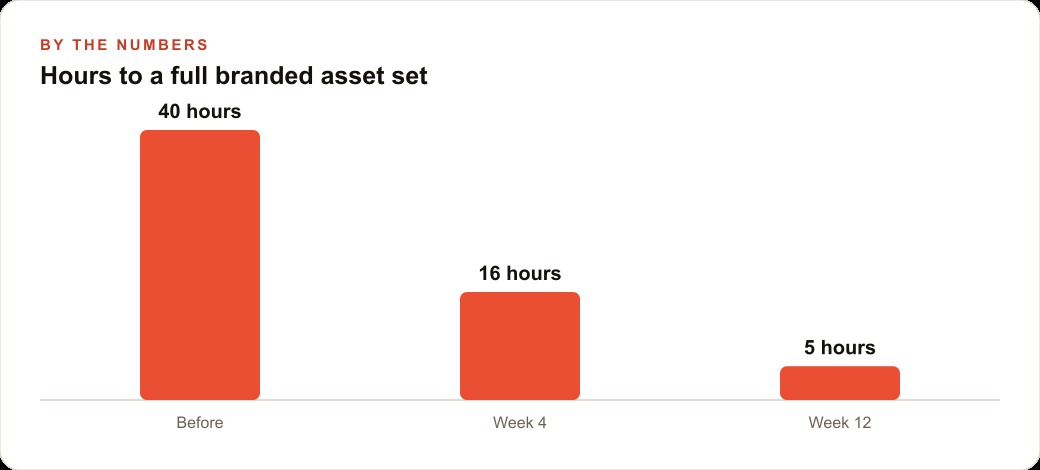
Put illustrative numbers on the payoff. A full branded asset set, deck, site, menu, promo cards, done the old way through a freelance designer might run a stretch of billable weeks and several rounds of revisions. Built through one design system with the model discipline above, the same set can come together in a small fraction of that time, and every future asset reuses the system for almost nothing. That branded landing page becomes the destination for the spa's Facebook and Instagram ad campaigns, the consistent look reinforces every touch in the CRM and website stack where bookings and follow-ups live, and the same content foundation feeds SEO and organic search without redoing the design each time. The result is a med spa that looks like it hired a studio, built in a fraction of the time.
The habit that keeps it cheap over the long run
The ten points above will get you a great first result, but there is a meta-habit that decides whether Claude Design stays affordable over months of real use, and it is worth stating on its own. Every choice in the workflow is really a choice about where to spend a limited resource. The design system is spent once and reused forever. The expensive model is spent on the first build and the planning, never on a font tweak. The precise click-to-edit is spent instead of a paragraph of re-prompting. The brainstorming is spent in cheap regular chat, never in Design. Read the whole list back and you will notice it is one idea repeated in different places: reserve the costly moves for the work that only the costly move can do, and route everything else to the cheap path.
That habit is what separates an owner who uses the tool casually all month from one who exhausts the limit in a single ambitious afternoon and then cannot touch it for days. It also compounds. The first design system takes real effort and a meaningful chunk of your limit to get right. Every asset after it is nearly free, because it inherits the system instead of rebuilding the brand. So the return on the tool improves the longer you use it, which is the opposite of how most people assume it works. They expect to burn the limit fast and give up. In practice, a disciplined owner finds that month two is far cheaper than month one, because the expensive foundation is already built and the daily work is just precise, low-cost edits on top of it.
For the med spa, that means the holiday promo cards in December cost almost nothing to produce, because the palette, the logo handling, the typography, and the layout language were all settled back when the design system was built. The spa is not paying to design a brand every time it needs a graphic. It is paying once for the system and then drawing from it freely, the same way a well-organized business draws leads from a foundation it built once rather than starting from zero every campaign.
If there is a single mistake I would warn any owner away from, it is starting the first real project before the design system exists, because it feels faster and it costs you everything downstream. A deck built without a system looks fine on its own, but the moment you build the second asset the colors drift, the fonts do not quite match, and the logo sits differently, and now you are hand-fixing inconsistencies that the system would have prevented for free. Spend the up-front effort on the foundation, resist the urge to jump straight to the shiny asset, and every piece afterward comes out aligned by default. The order is the whole discipline, and getting it right on the first project is what makes the tool feel effortless on the tenth.
What makes the whole approach worth it for a small business is that it turns branding from a recurring expense into a one-time asset you keep improving. Instead of paying a designer every time you need something new, you own a system that produces on-brand work on demand, and that ownership is the real prize. The tool will keep changing, but a brand you can carry into any channel, and reproduce consistently whenever you need it, is the kind of foundation that pays off for years.
You can absolutely learn this workflow and run it yourself, and the ten points above are the shortcuts that keep it affordable. Or you can bring in someone who has already built brand systems this way and wants yours to look right from the first version.
That is exactly what we do at AI DOERS. Book a private 30-minute call with Madhuranjan Kumar and we will map the fastest path to it for your specific business.
Book your call →
Madhuranjan Kumar
Madhuranjan Kumar brings 20 years of performance-marketing experience and has managed over $200 million in Facebook ad spend for brands across the United States and beyond. His expertise spans the full modern marketing stack: Meta, Google Ads, TikTok, email automation, CRM, and the websites that hold it together. At AI DOERS he turns that track record into lead-generation systems for businesses across every industry.