
How a Full iOS App Got Built and Shipped From a Phone With AI
A complete iOS and iPad app was built, wired to two real APIs, kept in sync across devices, and submitted to the App Store without ever opening a computer. Here is what that workflow means for a business that wants its own app.

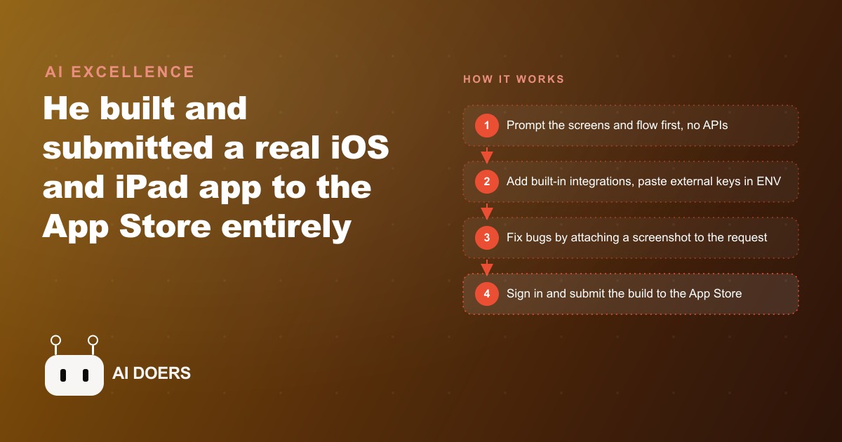
Building an iOS app from a phone with no laptop sounds like a party trick. Madhuranjan Kumar's view is that the trick is the workflow, not the phone. A full iOS and iPad app, wired to two real external APIs, tested across two device form factors simultaneously, and submitted to the App Store without touching a computer, ran entirely inside a tool called VibeCode, which executes Claude Code on a virtual machine in the cloud. The demo app photographed the user, searched a movie title, and swapped the user's face onto the poster using a real production face-swap API. The specific app does not matter. The nine things below are the parts of this workflow that transfer to any business that wants to build and ship a real mobile app without a development team.
1. The first prompt does exactly one job: build the screens, add nothing external yet
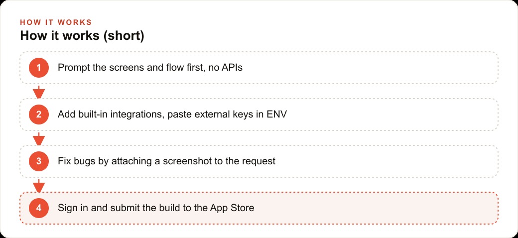
The single most reliable predictor of a clean phone-first build is how the first prompt is written. In the VibeCode workflow, the opening prompt did one thing: build the onboarding screens and the core user flow with no API connections attached. No data sources, no external services, no integrations of any kind. Just the screens, the navigation, and the input fields.
This sequencing exists for a specific reason. Screens and APIs are two separate concerns, and building both at once means any change to either side forces rework on the other. If the onboarding form needs an additional field, that changes the data structure, which can break an API integration already built around the original structure. If the API response format differs from what was expected, the screen designed to display that data needs to be redesigned. Keeping them separate means each can be verified independently before they are combined.
For a law firm building a client intake app, the first prompt describes the screens: a contact information form, a practice area selector, a date-of-incident field, a document upload button, and a booking confirmation screen. No calendar API, no document storage service, no third-party booking tool. Just the screens, arranged in the sequence a first-time user would move through. When those screens work correctly and a test user can navigate without help, the integrations follow in the next stage. That order is the single most important habit in phone-first building.
2. Syncing two devices costs nothing and catches layout problems before users find them
Logging into the same VibeCode account on an iPhone and an iPad keeps one codebase in perfect sync across both devices. A change made on the phone reflects on the iPad within seconds. No file transfer, no separate build process, no manual sync. The two devices run the same current version of the app continuously throughout the build.
The practical value is catching layout problems that only appear at a specific screen size. A form field that renders cleanly on a 6.7-inch phone screen may stack or overlap on a 10-inch tablet. A button sized correctly for iPhone navigation may look oversized on the iPad's wider canvas. With both devices running the same build simultaneously, these problems surface during the build rather than after the submission, which is where they are cheap to fix.
For a law firm's intake app, the partner reviewing matters uses an iPad at their desk. The receptionist collecting intake information uses an iPhone at the front counter. Both experiences need to present the same data clearly on their respective screens. Testing both simultaneously during the build, with no additional cost and no separate device management, makes it possible to design for both from the first session rather than treating the tablet layout as an afterthought.
3. Built-in integrations skip the key management step entirely and most builders overlook them
VibeCode ships with a library of built-in integrations: Apple Maps, current weather data, stock price data, and the TMDB movie database, among others. These are added to the app by including them in a prompt. The platform handles the key management entirely. No separate developer account required, no credit card added to a third-party service, no API key stored in a configuration file that needs to be kept out of public repositories.
For builders familiar with wiring APIs manually, built-in integrations feel almost too easy, and the instinct is to skip them in favor of a third-party service that feels more familiar. That instinct is expensive. The built-in integrations are production-quality, maintained by the platform, and included in the plan's usage at no additional per-call cost.
For a law firm app, the built-in Apple Maps integration handles office location display without requiring any external API account. The intake confirmation screen can show the nearest office on a map with a directions button that opens the native Maps app. The whole feature is one prompt: show the office address on an Apple Maps view with a directions button. The implementation detail, the API authentication, the map tile loading, and the directions handoff, is handled entirely by the platform.
4. Pasting the documentation URL beats explaining the API behavior in the prompt
For services that are not built into the platform, the most effective technique is pasting the API documentation URL directly into the prompt alongside the environment variable reference. The agent reads the documentation page, understands the authentication structure, the endpoint format, the required request parameters, and the response schema, then wires the integration correctly on the first attempt.
This works because the agent can read URL content in the context of a prompt and use it to inform the implementation. The alternative, describing the API behavior in the prompt without a documentation link, forces the agent to work from general knowledge of how that category of API might behave. General knowledge is close but not always exact, and the implementation may need debugging rounds when the specific behavior of this API differs from the assumed pattern.
In the demo, the Segmind face-swap V4 API required two things: the key in the ENV tab and the Segmind documentation link in the prompt. The agent read the documentation, understood the specific request format, and produced a correct integration on the first pass. For a law firm's secure document upload feature, the same approach applies: paste the storage service key into ENV, paste the service's documentation URL into the prompt, tell the agent to read the docs and wire it correctly. The rounds of debugging that result from the agent guessing are avoided entirely.
5. A screenshot is a better bug report than a paragraph of description
Layout bugs in a mobile app are inherently visual, and describing them in text requires specifying the device size, the keyboard state, the scroll position, and the behavior of surrounding elements before the description is accurate enough to act on. A screenshot captures all of that context in a single image and takes three seconds to capture.
The workflow: when a visual problem appears, reduce the view with a pinch gesture, capture a screenshot, attach it to the next prompt, and write one sentence describing the specific fix needed. The agent reads the screenshot, understands the visual context of the problem, and implements the correction. The round-trip from spotting the bug to implementing the fix is a single prompt exchange.
The keyboard-covering-input bug in the demo is a common one. The date-of-incident field is positioned low enough on the screen that when the keyboard appears, it covers the field entirely. Describing this in text requires specifying the field name, the keyboard behavior, the device being tested, and what the desired behavior should be. A screenshot with a one-sentence fix request communicates all of that in four seconds. For a law firm's intake form, where the professional experience matters to the client relationship, fixing visual problems quickly and accurately during the build is not optional.
6. Queuing three prompts keeps the build moving while the agent catches up on the previous ones
VibeCode's implementation of Claude Code allows up to three prompts to be queued at once. While the agent is building one change, the next two are staged and ready to execute immediately when the current task is complete.
This queuing behavior changes the tempo of a build session in a concrete way. Without queuing: submit a prompt, wait for completion, review the result, write the next prompt, submit, wait again. With three in the queue: submit a prompt, review the most recent completed change while writing the next two, queue both, continue reviewing. The build moves roughly two to three times faster because the operator's review time and the agent's build time overlap rather than running sequentially.
For an app with several distinct features, the difference between no-queue and three-queue execution is measured in hours. A set of six additive changes that might take four hours sequentially takes under two hours with the queue running. The constraint is that queued prompts should be independent of each other: do not queue a prompt that assumes the previous one completed in a specific way if there is any uncertainty about the outcome. For clear, additive changes like adjusting a button label, adding a new screen, and changing the navigation bar title, queue them in the same batch freely.
7. Device-specific layout behavior is one plain-language instruction, not a separate build
A common misconception about apps that run on both iPhone and iPad is that separate code is needed to produce different behavior on each device. In the VibeCode workflow, device-specific layout is handled by asking for it in plain language in a single prompt within the existing codebase.
In the demo: make the poster images twice as large on iPhone and four times as large on iPad. One instruction, one codebase, adaptive behavior on two different screen sizes. The agent implements conditional sizing that reads the current device type and applies the correct layout for each. No separate project, no platform-specific codebase, no duplicated screen definitions.
For a law firm app, the tablet and phone experiences genuinely need different layouts. The partner on an iPad wants to see the intake queue and the document preview side by side in a split-pane layout. The receptionist on an iPhone wants a single focused view with large tap targets and minimal scrolling. Both layouts can be specified in a single prompt after the base app is running: on iPad, show the intake list and the document preview side by side using a split view; on iPhone, show one view at a time with large buttons and clear navigation. The agent handles the conditional layout without requiring a separate design or build process.
8. The App Store submission runs entirely from the phone and takes less than an hour
Submitting to the App Store from a phone sounds like the technically demanding part of the workflow. In practice, it is the most straightforward step, because VibeCode handles the compilation and packaging in the cloud. The operator provides an Apple Developer account sign-in inside VibeCode and an Expo access token that links the build to the operator's Expo project. VibeCode compiles the app, packages it, and uploads it to App Store Connect automatically. A TestFlight link is generated as part of the process.
The App Store review submission form in App Store Connect is fully functional on mobile. The required fields, app description, keywords, screenshots, age rating, and privacy policy URL, are all completable from a phone. The privacy policy needs to be a real hosted URL, which can be a one-page document published to any web host. Screenshots are captured directly from the TestFlight build on the device.
First-submission review time is typically 24 to 48 hours. The most common rejection reasons are a missing or broken privacy policy URL and screenshots that do not accurately represent the app in use. Both are preventable by reviewing the App Store submission requirements before submitting and running the app through TestFlight with five actual test users first. A brief TestFlight phase before the full submission catches the issues that would otherwise cause a rejection and resubmission cycle.
9. The second version is where the real investment should go, not the first
The first version of any app should do one thing well and prove that the idea solves a real problem. Get it to TestFlight as quickly as possible after the core functionality works, share it with the people who need it, and observe how they use it without providing guidance. The specific things they struggle with, the features they reach for that are not there, and the ones they ignore entirely are the product feedback that the first version exists to collect.
For a law firm intake app, the first version collects contact information, practice area, date of incident, a document upload, and books a consultation slot. After two weeks of real use by actual potential clients, two patterns emerge: most clients skip the practice area selector because the options are legal terms they do not recognize, and almost every client wonders after submitting whether anyone received their information. Both observations are specific and actionable. Version two renames the practice area options in plain language and adds a submission confirmation screen with a reference number and an expected response timeframe.
Version two is built with the knowledge of what the app actually needs to be rather than what was assumed. The phone-first workflow supports this iteration pace naturally, since each new build continues from the existing codebase and the agent updates the app in place.
The revenue case: the law firm's intake app converts five additional consultations per month that previously required a phone call, a follow-up email, or a missed opportunity because no one was available to answer. At $500 per initial consultation, that is $2,500 per month in additional qualified revenue from a tool that cost under $100 in API usage to build and under $50 per month to run. The version-two improvements, based on two weeks of real usage data, tighten the conversion further by reducing friction at the two points where the first version was losing potential clients. The second version is the version worth investing in because the first version taught you exactly what it needs to be.
That is exactly what we do at AI DOERS. Book a private 30-minute call with Madhuranjan Kumar and we will map the fastest path to it for your specific business.
Book your call →
Madhuranjan Kumar
Madhuranjan Kumar brings 20 years of performance-marketing experience and has managed over $200 million in Facebook ad spend for brands across the United States and beyond. His expertise spans the full modern marketing stack: Meta, Google Ads, TikTok, email automation, CRM, and the websites that hold it together. At AI DOERS he turns that track record into lead-generation systems for businesses across every industry.