
Gemini Canvas: Turn Any Text Into a Web Page, Quiz, or Infographic in One Click
Gemini Canvas is a writing space with AI buttons that reshape, retone, and repackage your draft. Here is what it does and how a small business can use it to write once and publish in several formats.

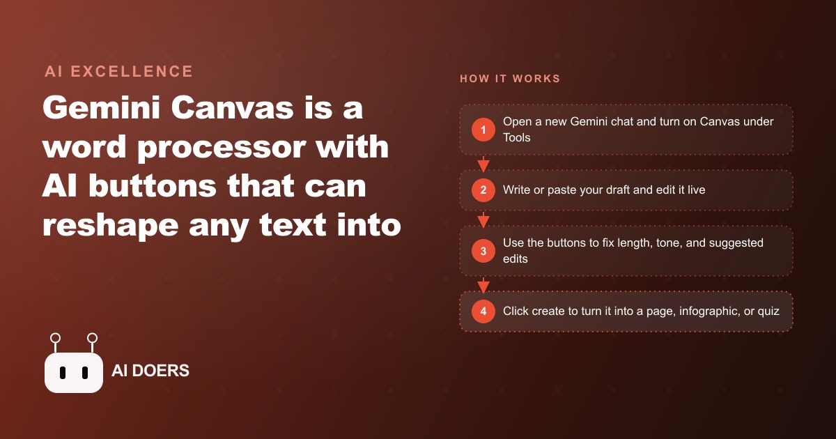
Most small teams write something useful once, a service explainer or a seasonal promo or a training note, and then let it die in a single format. Gemini Canvas is the tool that breaks that habit, because it lets you write one draft and reshape it into a web page, an infographic, or a quiz without touching the words twice. This is a working playbook for using it that way, built from the order of operations that actually holds up when you sit down to do it.
Think of Canvas as a familiar document editor with a row of AI buttons bolted onto the side. The writing surface feels like any cloud document you have used, so nothing about it needs learning. The buttons are the part worth your time, and the sequence you press them in is what separates a clean result from a frustrating one. Get the order right and an owner can stand up a repeatable content workflow in a single afternoon.
Turn Canvas on before you write a single word
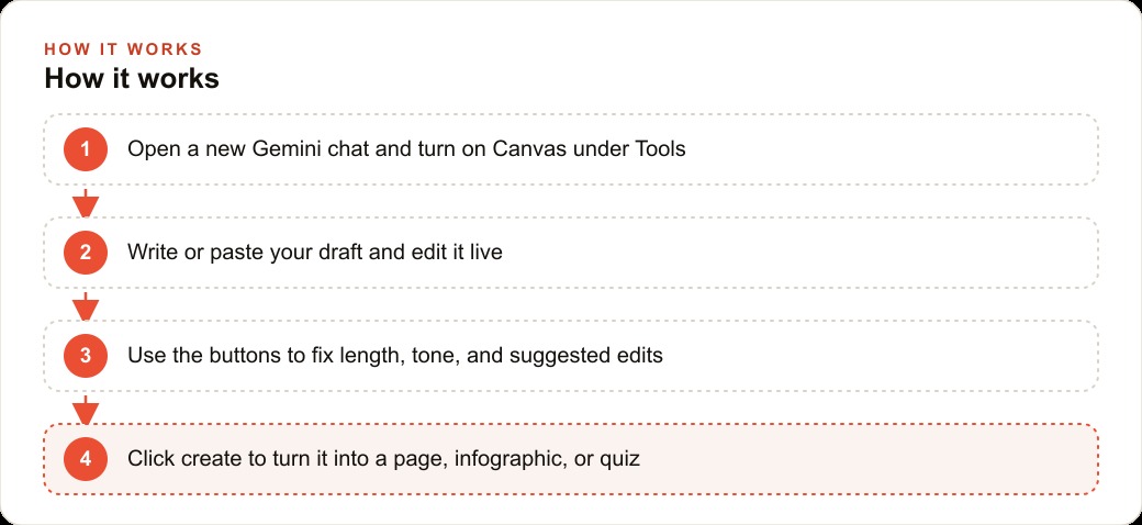
The one step almost everyone misses is that Gemini does not assume you want a document. You have to switch Canvas on yourself. Open a new Gemini chat, go into the Tools menu, and enable Canvas before you type anything. If you skip this, you get an ordinary chat reply instead of an editable canvas, and none of the reshaping buttons appear. This is different from tools that guess when you need a document, and the difference trips people up on their first try.
Once Canvas is active, you write a prompt the same way you would anywhere else. Ask it to draft a short article on a topic, paste in copy you already have, or start from a blank document and type directly. Whatever you do, the result opens in the editable canvas rather than as a static answer, and every edit you make from that point saves on its own the way a cloud document does. The latest version is always the one in front of you, so there is no save button to worry about and no risk of losing a revision.
It helps to understand what you are actually looking at. The left side behaves like a chat, where you can ask for changes in plain language, and the right side is the live document those changes land in. You can work either way, typing directly into the document like an editor, or asking the chat to make a change and watching it appear. Most people settle into a rhythm where they do the structural work by talking to the chat and the fine detail by editing the document by hand. Neither approach is wrong, and switching between them mid-draft is fine because the document state is shared across both.
Bring in one piece of content you already have
Do not start this workflow with a blank page and a vague idea. Start with something real that your business already uses and already needs in more than one place. A pricing explainer, a frequently asked question, an onboarding note, a seasonal offer, any of these works. The reason matters: the AI buttons are only as good as the material you give them, and a solid existing draft gives them something concrete to reshape. A half-formed idea gives them nothing to hold.
Paste that piece into the canvas and read it once as a plain document before you press anything. You are checking that the core message is clear and the facts are right, because everything downstream inherits from this draft. If the page you eventually generate is wrong, it is wrong because the source draft was wrong, not because the button failed. Spend the first few minutes here and the rest of the playbook goes faster.
Shape the draft with the length and tone controls
Now the buttons earn their place. Two of them handle the mechanical shaping. The length slider shortens or expands the entire piece in one motion, which is exactly what you want when the same content has to fit a banner in one place and a full web page in another. Drag it down and the draft tightens without you rewriting a sentence. Drag it up and it fills out. This single control is what lets one source serve an email teaser and a long explainer without maintaining two copies.
The tone control rewrites the same content to read more formal or more friendly. This is where you match the piece to the audience without changing the underlying facts. A note that reads correct but stiff becomes approachable in one press, and a casual draft becomes professional when the situation calls for it. Run these two controls first because they change the whole document, and you want the structure settled before you start accepting sentence-level edits.
Run suggested edits and keep only what earns its place
The suggested edits button is the one I lean on most. It marks the spots in your draft that could be stronger and shows the improved wording already drafted, so you are not asked to invent the fix yourself. You simply accept the ones that genuinely read better and skip the ones that do not. This is a review step, not an autopilot step. Read each suggestion against your own judgment, because the tool is proposing options and you are the one who knows the business.
The discipline here is to keep only the changes that earn their place. It is tempting to accept everything because the drafted wording looks polished, but polish is not the same as accuracy, and a suggestion that smooths a sentence while blurring a fact is a bad trade. Work through the marks in order, accept the clear wins, skip the rest, and you end with a draft that is both cleaner and still correct. That editorial judgment is the part no button can do for you, and it is where most people either add real value or quietly introduce errors.
Spin the same draft into a page, an infographic, and a quiz
This is the payoff and the reason the whole workflow exists. In the corner of the canvas is a create field, and with a single click it turns your finished draft into a clean web page, a structured infographic, or an interactive quiz. You wrote the content once. Now you reshape it into whatever medium fits the moment, without rebuilding it three separate times.
The decision that matters here is which format serves which purpose. A page is for sharing and for search, so anything a customer might look up belongs there. An infographic is for glance-value, so deadlines, steps, and comparisons that benefit from a visual layout go there. A quiz is for teaching and for checking understanding, so anything a new hire or a customer needs to actually absorb becomes a knowledge check. Generate the formats that match how the content will be used, not all three by reflex. The same draft that becomes a helpful page for customers can also feed the practice website, and when you build the page as its own asset it quietly supports SEO and organic search without any extra writing on your part.
A worked example: an accounting firm's tax-season content
Here is how the playbook runs end to end for an accounting firm, with illustrative numbers to show the shape of the return. Tax season generates a flood of repetitive explanations. What documents should a new client bring, how do quarterly estimates work, what changed this year. In a typical season the front office fields the same three or four questions dozens of times, and each answer is written from scratch in an email that reaches one person and then disappears.
The owner drafts each explanation once in Canvas in plain, calm language, then runs the length and tone controls so the quarterly-estimates piece reads professional but approachable. Suggested edits tighten the wording. Then the create field does the real work. From that single document the firm generates a clean web page to send to any client who asks, an infographic that lays out the deadlines and amounts at a glance, and a short quiz a junior staff member uses to confirm a new hire actually understands the process. The length slider keeps a long explainer short enough for an email and full enough for the website without a second rewrite.
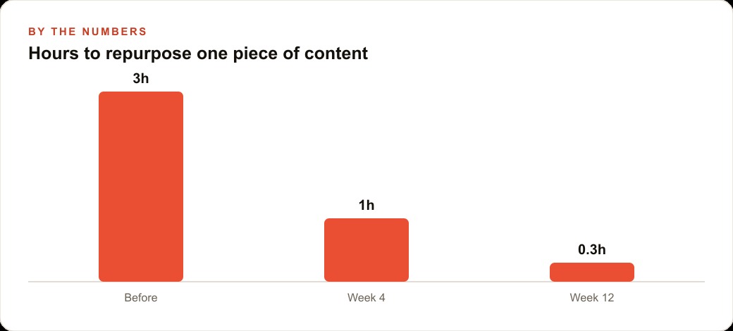
Put rough numbers on it. Before Canvas, repurposing one piece of content into two or three usable formats took the firm around three hours of a staff member's time, mostly spent reformatting and hand-building a graphic. With the workflow above, that drops to roughly one hour by the fourth week as the team learns the button order, and closer to twenty minutes by the twelfth week once the templates are reused season over season. Ten of these explanations, produced in a single focused afternoon, become a small library of client-facing material that all carries the same clear voice. That consistency is worth as much as the time saved, because a busy firm sounds like one firm instead of ten different email styles.
Because the core Canvas features run on a free Google account, the tool cost of this is effectively zero. The whole investment is the time to write the source drafts well and the judgment to decide which content deserves a page versus a quiz versus a printable. Any business that produces written content sits on material that could be working harder in more formats, and the same discipline that turns tax explanations into a content library also gives you a base of copy that supports paid work, because a clear explainer page is exactly the kind of destination that makes Facebook and Instagram ad campaigns convert instead of bounce.
Decide the format by the job it has to do
It is worth slowing down on the format decision, because this is where the whole workflow either creates leverage or just produces three versions of the same thing nobody needed. A page earns its place when the content answers a question people go looking for, which is why service explainers, pricing breakdowns, and policy notes belong there. Those pages accumulate value over time, get shared in emails, and get found in search, so the effort of building them once pays back repeatedly.
An infographic earns its place when the value is in seeing several facts at once. Deadlines, a sequence of steps, a comparison between two options, a small set of numbers that only make sense side by side, these are the things that a paragraph flattens and a visual layout sharpens. Do not turn narrative prose into an infographic just because you can, because a wall of sentences squeezed into boxes helps no one. Reserve the format for content that genuinely benefits from being seen rather than read.
A quiz earns its place when someone needs to prove they absorbed the material. That is obvious for training a new hire, but it also works for customers, because a short self-check on a service or a process quietly teaches while it engages. The same tax explanation that becomes a page for clients and an infographic for the waiting-room screen becomes a five-question quiz that a junior staff member takes on their first day. One draft, three jobs, and each format matched to the job it does best.
Keep every document as a reusable asset
The last habit that makes this worth doing is treating each finished document as an asset rather than a one-off. Do not close the canvas and forget it. Keep it, because next season you refresh the same draft in minutes instead of starting over, and the page, infographic, and quiz regenerate from the updated source. Over a year this compounds into a genuine library, and the marginal cost of each new format keeps falling.
Where teams stall is not the mechanics, which are simple, but the editorial call about what to build and how to write it so the buttons have something solid to shape. That is the skill worth developing, and it is entirely learnable. You can run this whole playbook yourself with the steps above, or bring in someone who has built these content systems many times and have the workflow handed to you ready to run, wired into the wider CRM and website stack so the pages you generate actually get in front of the people who need them.
That is exactly what we do at AI DOERS. Book a private 30-minute call with Madhuranjan Kumar and we will map the fastest path to it for your specific business.
Book your call →
Madhuranjan Kumar
Madhuranjan Kumar brings 20 years of performance-marketing experience and has managed over $200 million in Facebook ad spend for brands across the United States and beyond. His expertise spans the full modern marketing stack: Meta, Google Ads, TikTok, email automation, CRM, and the websites that hold it together. At AI DOERS he turns that track record into lead-generation systems for businesses across every industry.