
How to Design a Custom Landing Page With AI in About 10 Minutes
Screenshot a look you love, let AI rebuild the background and layout, lock one image style, and ship a clean landing page with no code and no designer. Here is the workflow and how I would run it for a hair salon.

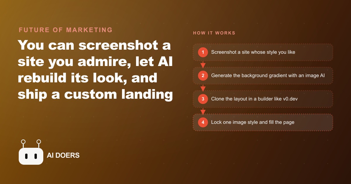
The common assumption about building a professional landing page is that you need design talent to produce something that looks custom. You need an eye for typography, a feel for color theory, and the spatial reasoning to arrange elements in a way that communicates intent rather than accidents. I am Madhuranjan Kumar, and I want to argue that assumption has been wrong for years and is now conclusively wrong. The design degree was never the bottleneck. The reference image is.
The design degree was never the bottleneck, and it still is not
Professional designers do not design from nothing. They design from references. Every agency, every freelancer, every studio that produces work clients call beautiful started by assembling a mood board, a collection of existing work that establishes the direction. The client selection of which reference feels right, combined with the designer's ability to execute in that direction, is where the actual design work happens. The creative generation part, the part that looks like talent, is mostly a trained pattern-matching skill applied to a target established by references.
What changed with AI tools is that the execution step no longer requires the trained pattern-matching skill. You provide the reference. The tool executes in that direction. Your job shifts from developing execution skill to developing judgment about which references are right for your brand and which direction actually serves your audience.
That judgment, knowing what the page should feel like for the specific customer you want to attract, is something most business owners already have. A salon owner knows immediately whether a reference image feels luxurious or cheap. A contractor knows immediately whether a reference looks trustworthy or generic. The ability to say this is the feeling I want and this is not is not a design skill. It is brand taste, and it is distributed far more widely than design execution skill.
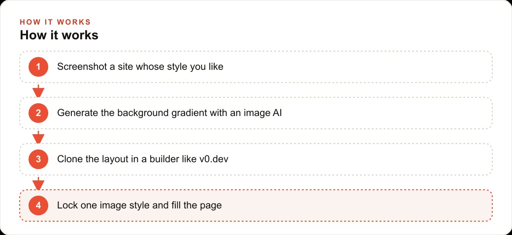
The practical implication is that the vibe design workflow, taking a screenshot of a site whose aesthetic you admire and using that as the reference for your own page, is not a workaround. It is the same starting point a professional designer uses, with the execution step handled by the AI rather than by the designer's hands.
A reference screenshot does more design work than most designers admit
The quality ceiling of any AI-built page is set by the quality of the reference provided. A well-chosen reference from a site with professional visual design, appropriate for the industry and audience, produces output that reads as built on purpose. A poor reference, or no reference, produces output that reads as assembled from defaults.
This means the single most leveraged decision in the whole vibe-design workflow is which site to screenshot. Not which tool to use. Not which prompt to write. Not which font to request. The reference decides the visual range the tool is working within, and the tool's job is to match that range for a different brand. The reference does most of the design work before the tool generates anything.
For a hair salon targeting a premium, editorial aesthetic, the right reference is a site from a high-end fashion brand, a design-forward beauty publication, or a luxury lifestyle brand that communicates the same feeling the salon wants clients to have when they walk through the door. That reference has nothing to do with the salon's actual business. It has everything to do with the feeling the salon wants to create. Using that reference produces a page where the visual feel is calibrated to the exact client segment the salon is trying to attract.
The wrong reference for the same salon is a site from a competitor salon. Competitor sites are built to the same constraints the salon is trying to escape: limited budget, limited design skill, generic templates. Referencing them sets a ceiling at the competitor level rather than at the aspirational level. The whole point of the vibe-design workflow is that the ceiling is now the best visual design anywhere on the internet, not the best visual design in your budget. Use that freedom.
Building back to front is the rule professionals follow but nobody teaches
Every professional working in visual design knows that the correct sequence for building a page is from the background forward. Settle the background and the overall palette first. Build the layout and structural elements second. Add imagery and content third. Write the copy last. Working in reverse order, starting with copy and adding structure around it, produces a page that looks assembled rather than designed because the visual foundation was never established before the content was placed on top of it.
This sequencing rule is obvious in practice and invisible in instruction because it is the kind of tacit knowledge that designers develop through experience rather than through explicit teaching. Nobody writes it down because to someone who has built pages for years it feels as obvious as building the walls before the roof. To someone building their first page with AI tools it is not obvious at all, and violating it is the source of most of the frustration that leads people to conclude that the AI-generated result looks messy.
The practical sequence is: generate the background gradient first as a standalone horizontal image, carrying only the color and the mood, without any foreground elements. Use that background as the first input to the layout tool. Set the palette and structural layout before adding any text or imagery. Generate all page images in a consistent, locked style before placing any of them. Write the copy last, when the visual context for where the copy will sit is already established.
This sequence produces a page that feels intentional at every level because each layer was established in its correct order. The copy feels appropriate because it was written for the visual context that already existed. The images feel cohesive because they were all generated within the same locked style. The layout feels considered because it was built on a background that established the mood before anything else was placed.
The order of operations most people get backwards
Most people who try AI-based page design for the first time work in the opposite order. They start with copy, because copy is the most familiar element and the one they have the most opinions about. They then add placeholder imagery because the page needs something visual. They then try to find a layout that works around both the copy and the images. They then add a background that does not clash with what they already placed.
Every step in that sequence is harder than it needs to be because the constraint from the previous step is working against the current step. The copy was written without a visual context, so some of it needs to be rewritten when it is placed in a design that makes the original phrasing awkward. The images were chosen before the style was locked, so some of them clash with others. The layout is constrained by copy and images that were not designed to work within a layout.
The back-to-front sequence removes every one of those constraints. The background is established with no constraints. The layout is built against the background with no content constraints. The images are generated after the layout is established so they fit the space they will occupy. The copy is written last, with full knowledge of where it will sit, how much space it has, and what visual weight the surrounding design carries.
The difference in output between these two sequences is visible and significant. Both use the same tools and the same skill level. The back-to-front sequence consistently produces a result that reads as designed. The front-to-back sequence consistently produces a result that reads as assembled. The sequence is the variable that most instructional content on AI design tools fails to address explicitly.
One image style matters more than the entire layout
The single change that most dramatically improves the quality of an AI-built page is locking a consistent image style before generating any images. Pages that use images generated in multiple different styles on different days, or images pulled from different sources with different visual languages, look unfinished regardless of how strong the layout is. The visual inconsistency reads as amateur to any viewer, even viewers who could not articulate why the page feels incomplete.
Locking a style means using a tool that lets you define a visual style once and then apply it to every image generated for the project. You describe the style with two to three reference images, the tool produces a saved style definition, and every image generated from that point forward comes out within the same visual range. A service card image, a hero background image, an icon image: all of them share the same lighting, the same color treatment, and the same visual density.
This practice does for imagery what the back-to-front sequence does for layout. It establishes a constraint that makes every subsequent decision easier rather than harder. The question is not whether this particular image works on this page. The question is whether this particular image was generated in the locked style. If yes, it works. If not, it gets regenerated.
For a salon or any business building a page that will carry images of specific services, locking the image style before generating any service imagery is the single highest-leverage step in the whole process. The difference between a page where all the service images share a visual language and one where they come from different sources or different generation sessions is the difference between a page that looks like it was designed for this brand and one that looks like a template with different images swapped in.
The argument across all four of these points is the same: the design work is in the decisions, not in the execution. The tool handles execution. Your judgment handles reference selection, sequencing, and style consistency. That division of labor is favorable to business owners who have brand taste and client knowledge but not design execution skill. Which, as it turns out, is most business owners.
That is exactly what we do at AI DOERS. Book a private 30-minute call with Madhuranjan Kumar and we will map the fastest path to it for your specific business.
Book your call →
Madhuranjan Kumar
Madhuranjan Kumar brings 20 years of performance-marketing experience and has managed over $200 million in Facebook ad spend for brands across the United States and beyond. His expertise spans the full modern marketing stack: Meta, Google Ads, TikTok, email automation, CRM, and the websites that hold it together. At AI DOERS he turns that track record into lead-generation systems for businesses across every industry.