
How a Custom App Got Built and Published in Under an Hour
With AI doing the heavy lifting, a simple, useful app can go from a sketch on screen to a published build in well under an hour.

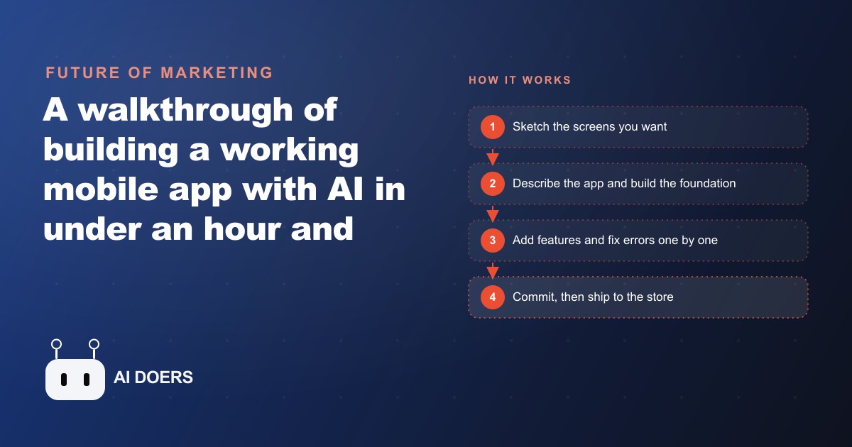
Someone took an app they had paid a monthly subscription for over several years, built their own version of it in under an hour using AI, polished the visual design, made final tweaks in a code editor, and submitted it to the app store. The build cost an afternoon and will now cost nothing per month. I am Madhuranjan Kumar, and what struck me about this particular build is not the speed, which was fast, but the straightforwardness of the workflow. It is a loop almost anyone can learn.
The sketch before the build is half the work
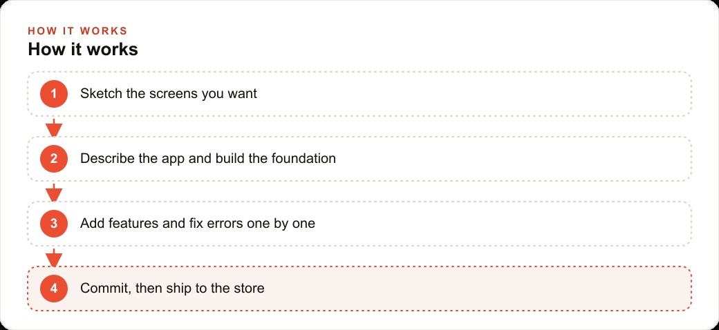
The build started not with a prompt but with a mockup. Arranging rough screenshots of the screens the app needed onto a board, before describing anything to the AI, gave the whole project a concrete target. The AI had a clear picture of what it was building toward before it wrote a single line.
This step is the most consistently undervalued one in AI-assisted development. When you describe an app without a visual reference, the AI makes layout decisions based on what it thinks is standard for that kind of app. When you start with a sketch, even a rough one with placeholder boxes and arrows showing the flow between screens, those decisions are yours. The AI is implementing a spec rather than guessing at intent.
For a first build, the sketch does not need to be detailed. Screenshots from a competitor's app, boxes drawn in a notes app, or even a hand-drawn diagram photographed with a phone are all enough. The goal is to answer the question of what should appear on each screen and how the user moves between them, before the build begins. That answer shapes every decision that follows.
Build the foundation first and resist adding everything at once
Once the sketch is ready, the first prompt asks for only the foundation: the navigation between screens, the core data structure, the basic layout. No extra features, no additional screens, nothing that was not in the sketch. The explicit instruction to not over-build the first pass is important. AI assistants have a tendency to add features proactively based on what usually accompanies the core feature. A booking screen might get a recommendation engine added. A checklist might get a calendar integration. Those additions are premature and make the foundation harder to understand and fix when something breaks.
A clean foundation, set up in a way that is easy to expand, is the starting point for everything that follows. Test it on a real device as soon as it exists. Does the navigation work? Does the core feature do what the sketch showed? If yes, commit the foundation and move to the first feature addition. If no, fix the foundation before adding anything.
Add one feature at a time and paste errors back when they appear
After the foundation is solid, the build advances through a loop: describe one feature in plain language, let the AI implement it, test it on a real device, and move to the next feature when it works. The loop is the method. Adding many features in a single prompt is the most common way to end up with a build that is fifty percent done and completely broken, because failures cascade when multiple changes happen at once.
Errors will happen. The right response to an error is not to rethink the approach. It is to copy the exact error message and paste it back to the AI with a brief description of what you were trying to do. The AI fixes the specific error and reloads. This error-fix loop is not a sign that the process is failing. It is how the process works. Expecting a first pass to be error-free is the wrong frame. Expecting to fix errors quickly through the paste-back loop is the right frame.
For a chiropractic clinic building a patient companion app, this loop might look like: foundation (three screens: home with next appointment, exercise screen, daily check-in), then add the ability to mark each exercise done, then add the daily pain rating, then add the morning reminder notification. Four separate prompts, four separate tests on a real device, four commits. The app that results from that sequence is more robust than one built from a single large prompt, because each feature was tested and confirmed working before the next one was added.
Generate images for items inside the app to make it feel finished
One feature that consistently improves how a finished app feels is AI-generated images for the items inside it. An exercise app where each exercise is represented by a clear, friendly illustration of the movement is significantly more usable than one where the exercise is just a text label. A recipe app where each dish has a clean photo instead of a placeholder is more likely to be used regularly. A product catalog where every item has a consistent, well-composed image builds more trust than one with inconsistent photography.
The AI that is building the app can also generate these images. Asking for a clean, friendly illustration of a specific physical therapy exercise, with plain background and clear form, produces something suitable for a healthcare app in seconds. Repeating that for each exercise in the set takes a few minutes and results in a visual quality that would otherwise require a designer.
For a service business whose app presents checklists, procedures, or catalog items, this is the step that moves the result from a working prototype to something a client or patient would actually want to use and keep on their phone.
Move to a code editor for polish and commit before shipping
Once the core is working and the images are in place, the final quality pass happens in a familiar code editor. The visual output from an AI-assisted build is usually functionally correct but can have spacing inconsistencies, font choices that do not match the brand, or color values that are close but not exact. These are fast to fix in a code editor where the styling is visible and editable directly.
The commit before shipping is not optional. The work done in the code editor represents hours of refinement. Committing it to a repository before submitting to the app store means that if the submission fails for any reason, or if a review rejection requires a change, the work is preserved and the fix can be made on top of a stable base rather than from memory.
For any business considering whether this workflow is worth learning versus outsourcing, the code-editor polish step is the honest answer to that question. The AI handles the construction. A human with taste and brand knowledge handles the final quality. The split makes both parts faster than if either were done alone, and the result is more likely to be something the business is actually proud to put in front of its customers. For a business that also runs Facebook and Instagram ads, Google Ads, or manages its pipeline through a CRM and web stack, having a branded app that is consistent with the visual identity across those channels strengthens the overall customer experience. The app does not need to be a major investment in engineering to produce that consistency. It needs to be built carefully in the right order, starting with a sketch and proceeding one feature at a time.
That is exactly what we do at AI DOERS. Book a private 30-minute call with Madhuranjan Kumar and we will map the fastest path to it for your specific business.
Book your call →
Madhuranjan Kumar
Madhuranjan Kumar brings 20 years of performance-marketing experience and has managed over $200 million in Facebook ad spend for brands across the United States and beyond. His expertise spans the full modern marketing stack: Meta, Google Ads, TikTok, email automation, CRM, and the websites that hold it together. At AI DOERS he turns that track record into lead-generation systems for businesses across every industry.