
Claude's New Visuals Feature: Just Say Show Me
Claude's new visuals feature turns plain prompts into instant interactive whiteboards, triggered by the phrase Show me. It builds lightweight HTML, so live calculators and flowcharts appear almost as fast as plain text.

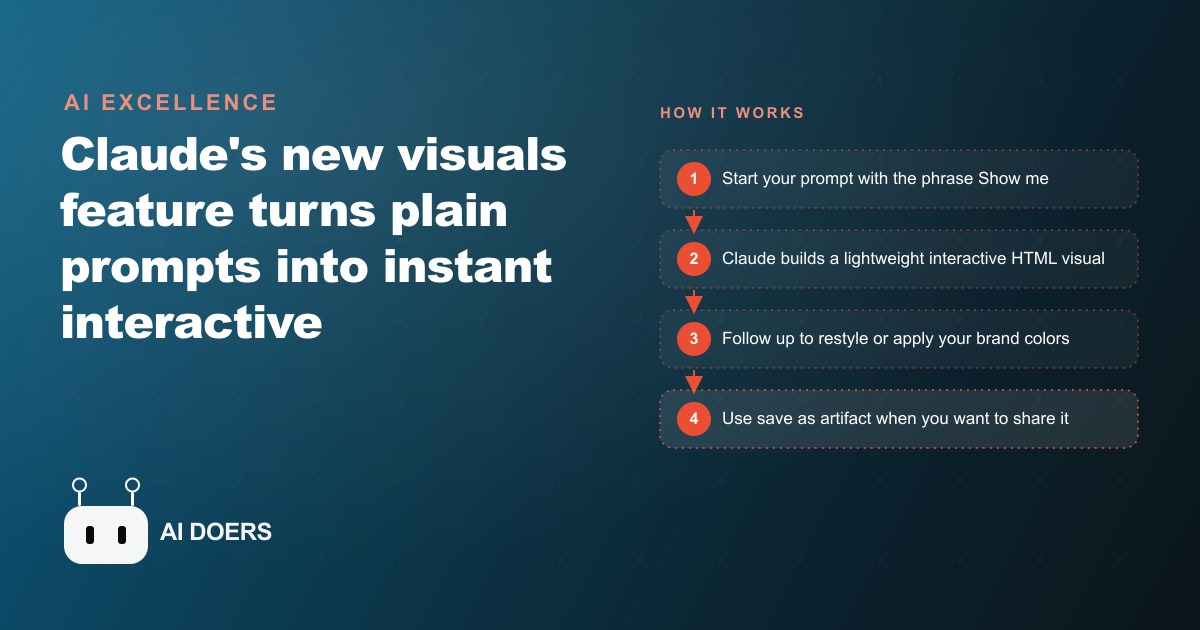
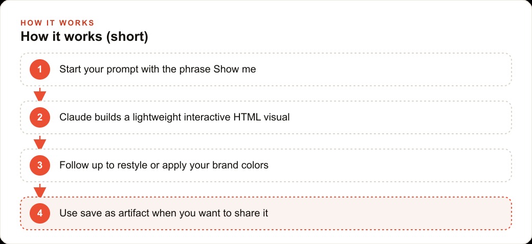
Two words changed what Claude delivers. Anthropic shipped a feature that converts the phrase "Show me" into a trigger for a live interactive visual instead of paragraphs. There is no setting to enable, no plugin to install, no plan upgrade required to access it on a basic account. You type "Show me" at the start of a prompt and Claude builds a working HTML visual in seconds: a calculator where you change the inputs and watch the output update, a flowchart that makes a dense process legible at a glance, a comparison table that answers the question before the reader finishes the first row. The visual appears almost as fast as plain text because it runs on minimal HTML rather than a graphics rendering engine. The design decision that makes this significant is the trigger mechanism. It is a phrase, not a mode, not a plugin, not a setting buried in a sidebar.
I am Madhuranjan Kumar. The business application of this feature is specific: it removes the step between understanding something and being able to show it to a client or team. Before this feature, getting AI to help you explain something complex meant receiving a text answer, understanding it yourself, and then opening a separate tool to build the visual. That is a two-step process with a context switch in the middle. "Show me" collapses it to one step inside the same conversation.
Show me is now Claude's most useful two-word command
Before this feature, "Show me" in a Claude prompt produced more text. Ask it to show how compound interest works and you got four paragraphs. Ask it to show the difference between three service tiers and you got a numbered list. The reader had to reconstruct the visual from the description, which is extra cognitive work that slows comprehension and, in a client-facing context, slows decisions.
The phrase now changes the output type. Claude generates a lightweight interactive HTML page that renders inline in the conversation. The compound interest example produces a working calculator with editable fields: principal, rate, compounding frequency, time period, and a live result that updates as any input changes. The service tier comparison produces a table with clear columns a client can scan in seconds rather than a list they have to read in order.
"Show me" is the most reliable all-purpose trigger because it leaves the format to Claude, which typically selects the most useful visual type for the specific question without requiring you to specify it. When you are not sure whether a calculator or a flowchart or a comparison table would serve better, "Show me" selects the right format. Variants that also work include "Draw a graph," "Create a visualization," and "Build me a flowchart." Each is reliable for its specific type. "Show me" covers all of them without requiring you to predict the right format in advance.
The model you use makes a visible difference in output quality. This feature runs noticeably better on Opus than on Sonnet. If you are on a free plan and your visuals look sparse or simplified compared to examples you have seen demonstrated, that is the likely explanation. A paid plan or an explicit Opus selection produces cleaner layouts, more sophisticated interactive elements, and more detailed diagrams. Testing both before committing to a client-facing workflow takes a few minutes and shows you the realistic quality ceiling.
Follow-up interaction is immediate and iterative. Once a visual appears, ask Claude to restyle it, apply your brand colors, add a column, simplify the diagram, or adjust a calculation. The updated visual arrives in seconds as part of the next response. There is no export, no re-upload, no tool switch. You refine the visual inside the same conversation where you produced it.
When a visual is polished enough to share or keep, the three-dot menu in the visual interface gives you the option to save it as an artifact. That converts the quick whiteboard sketch into a shareable interactive tool with a link. Copying the visual from the interface saves a screenshot rather than the interactive code, which is useful for documents but loses the live behavior. Saving as an artifact preserves the interactivity and makes the visual accessible to anyone with the link.
Calculators and flowcharts appear without a single line of code from you
The mechanism explains why the visuals arrive so quickly. Claude generates HTML, the simplest type of code a browser renders. It does not call an external graphics service. It does not run a design engine or a third-party rendering API. It writes a self-contained HTML document and displays it inline. The visual appears in roughly the same time as a text response because the code is minimal, not because the server is exceptionally fast.
This is specifically different from Claude artifacts, which have existed for longer and use more complex code than plain HTML. Artifacts take longer to generate, exist as standalone shareable objects with persistent links, and are designed to be revisited independently. The visuals feature is designed to be a quick whiteboard sketch embedded in the conversation: the fastest possible version of showing rather than telling. Use artifacts when you need a permanent, shareable, polished interactive tool. Use "Show me" when you need a fast visual that helps you or a client understand something in the current conversation.
The distinction matters in practice. A quick "Show me" at the start of a planning session produces a rough visual in seconds that you iterate in the conversation. After several iterations, when the visual represents what you want to share, you save it as an artifact and send the link. The artifact becomes the shareable asset. The "Show me" conversation is the workspace where you built it.
Understanding this distinction also clarifies the copy behavior. When you copy a visual directly from the conversation, you get a screenshot. That is useful for pasting into a document, an email, or a slide deck. But the interactive behavior is gone. The client who receives the screenshot cannot change the inputs on the calculator or trace the branches of the flowchart with clicks. The artifact preserves all of that. Choose the right export depending on whether the recipient needs to interact with the visual or just see it.
The real unlock is in comparison and planning prompts
The category of prompt that consistently produces the most useful output from "Show me" is the comparison or planning prompt where the reader needs to see structure rather than read about it. A comparison of three options is better as a table than as three paragraphs. A multi-step process is better as a flowchart than as a numbered list. A financial projection is better as a live chart than as a written estimate that requires the reader to perform the calculation mentally.
Research output is a use case that surprises business owners when they try it. After asking Claude to research three competing software platforms, the raw output is a long block of text. Adding "Now show me a comparison of those three by price, core capabilities, and the main limitation of each" converts that block into a visual table that answers the decision question before the reader has processed a single sentence. The upgrade from text to visual changes how quickly a client can decide, and faster decisions in a consultative sales context convert better.
Planning prompts are equally strong. "Show me a 90-day launch plan as a timeline with major milestones by week" produces a visual that makes the plan comprehensible at a glance. A numbered list of tasks requires the reader to hold each item in order to understand the overall shape. A timeline visual shows the shape immediately and invites the reader to question specific weeks rather than ask for a description of the overall structure. That shift from passive reading to active engagement changes how clients experience a planning conversation.
Numerical trade-off prompts are the most powerful category. Any time a client is choosing between options with financial implications, showing the numbers visually rather than stating them in sentences changes what the client understands and how confident they feel in the decision. When they can interact with the inputs themselves, adjusting variables to match their specific situation, the conversation moves from persuasion to confirmation.
Who benefits most from visuals over text
Businesses that regularly explain complex decisions, multi-step processes, or numerical trade-offs to clients who are not experts in the subject matter benefit most. The common thread is an explanation gap: the professional understands the topic thoroughly and the client needs to understand it well enough to make a confident decision. Text closes that gap slowly. A well-constructed visual closes it in a fraction of the time.
Financial professionals benefit most visibly. An advisor who produces a personalized interactive savings projection in a client meeting, one the client can adjust with their own numbers in real time, changes how that meeting feels and what the client decides. The client who moves an input field and watches their projected balance update understands the stakes of the decision differently than one who read a paragraph about projected outcomes.
Consultants and service providers benefit in a different way. When a client pays for strategic advice, the deliverable is the reasoning as much as the recommendation. A visual that shows the comparison of options, the decision structure, or the projected outcomes of different paths communicates the reasoning in a format the client can engage with rather than accept passively. Clients who see the structure ask better questions and accept recommendations with higher confidence, which reduces the revision cycles that eat into project margins.
Contractors, project managers, and anyone who delivers work in phases finds that clients who see a visual timeline ask about specific phases rather than asking when everything will be done. That shift in the nature of client questions changes the quality of the working relationship throughout a project. A client who understands the sequence is a better collaborator than one who is waiting passively for updates.
Anyone who sells anything that requires a client to understand trade-offs before deciding benefits from this feature. The decision to replace versus repair, the choice between three service packages, the trade-off between lower upfront cost and higher lifetime cost: all of these are decisions that clients make with more confidence when the structure is visible rather than described.
One worked example with illustrative numbers
A consultant working with small and mid-size business owners needed a repeatable way to show clients how flat-fee retainer pricing compared to hourly billing across different engagement scenarios. Each client had different assumptions about hours per month, rates, and expected revision cycles, so the comparison needed to be interactive rather than a fixed document.
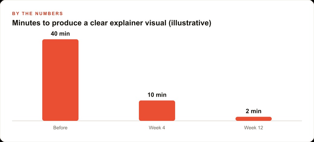
Before this feature, producing the comparison meant opening a spreadsheet, building the formulas, formatting the output, exporting a screenshot or PDF, and having it ready before the client call. For a client with specific numbers, the spreadsheet needed to be customized each time. The preparation process averaged roughly 35 to 40 minutes per client when done carefully, including the time to clean up the formatting and write the explanation for the follow-up email.
The consultant typed: "Show me a comparison of flat-fee versus hourly billing for a consulting engagement, with editable inputs for hours per month, hourly rate, and engagement length in months, and a live calculation that shows the total cost under each model and the break-even point where the flat fee becomes cheaper." Claude produced a working interactive calculator in under 90 seconds. The inputs were editable fields. The break-even calculation updated instantly when any input changed. The output showed both total costs and the crossover point as a clearly visible number.
In the next client call, the consultant opened Claude, typed the prompt, and walked the client through the calculator live. The client adjusted the hours-per-month input to match their own estimate and watched the numbers shift. The pricing conversation that previously took 15 to 20 minutes of explanation plus a follow-up email with an attached spreadsheet was completed in under 7 minutes with no follow-up needed.
Across one week of client calls, the consultant estimated that the old workflow combined spreadsheet preparation time and in-call explanation time to consume about 3.5 hours total. The new workflow, combining prompt time and a brief follow-up to apply the firm's brand colors to the visual, consumed under 15 minutes. The calculator was saved as an artifact after the first session and reused with minor input adjustments across subsequent calls. The hours recovered went into billable work. These numbers represent the pattern of the workflow rather than a specific engagement, but the direction holds consistently for any context where pricing comparisons need to be shown rather than described.
What to do with this starting today
Start with the explanation you repeat most often with clients or your team. Whatever that is, open Claude and type "Show me" at the front of a prompt describing it. Watch what appears. The first result tells you whether the format is useful immediately or whether a follow-up adjustment serves better. Ask it to apply your brand colors. Ask it to add or remove elements. Refine it in the conversation rather than opening a design tool.
After you have a visual that communicates the idea clearly, save it as an artifact. Build a small library of the four or five most common explanations your business makes. Each one takes under five minutes to produce and refine. That library becomes a communication asset your whole team can use, consistent in presentation and easy to update because refreshing it means prompting a new version rather than opening a file.
The feature is available now on a free Claude account. The output improves meaningfully on the Opus model. The only step between you and your first useful visual is typing the two words that trigger it.
That is exactly what we do at AI DOERS. Book a private 30-minute call with Madhuranjan Kumar and we will map the fastest path to it for your specific business.
Book your call →
Madhuranjan Kumar
Madhuranjan Kumar brings 20 years of performance-marketing experience and has managed over $200 million in Facebook ad spend for brands across the United States and beyond. His expertise spans the full modern marketing stack: Meta, Google Ads, TikTok, email automation, CRM, and the websites that hold it together. At AI DOERS he turns that track record into lead-generation systems for businesses across every industry.