
Claude Design in Practice: From Prompt to Working App
Claude Design generates websites, apps, dashboards, decks and videos from one prompt, keeps them on brand through reusable design systems, and hands the finished design off to Claude Code to become a real working app.

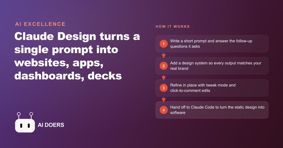
Claude Design ships a single prompt into a polished website, app, dashboard, pitch deck, or animated video. The most interesting thing about that capability is not the output. It is what the tool's actual limits reveal about where design value was always located, and which designers were producing it.
Claude Design does not threaten designers. It exposes which designers were never designing
The people most worried about Claude Design are, with few exceptions, not the designers who were doing design. They are the people executing the mechanical layer of design: applying a client brief to a template, adjusting spacing and color values inside a file, producing the third variation of a layout the client has already approved in concept. That work, executing a visually correct artifact from a clear specification, is precisely what Claude Design does well and quickly.
The designers who are not worried are the ones whose work is upstream of the file. The people identifying what problem the interface needs to solve. The people figuring out what the user's mental model is when they arrive at a page and what it needs to be when they leave. The people working out what the business's actual communication goal is versus what the stakeholder thinks it is. The people deciding how to sequence information so that a decision gets made rather than deferred. The people understanding which specific element is causing the conversion problem that more visual polish will not fix. None of that is in the prompt box. None of it will be, not in this generation of tools and not in the next one.
What Claude Design makes visible is that a significant portion of what the design industry priced as design was the file production, not the thinking that preceded it. File production is now fast and cheap. The market is finding out what it was actually paying for all along.
The prompt-to-prototype gap that still exists after Claude Design, and why it matters more than the gap it closed
Claude Design closed the gap between a text description and a visually credible prototype. That gap was real, and closing it is genuinely useful for anyone who previously needed to wait days for a designer to produce a mockup they could evaluate and show to stakeholders. But closing that gap left another one fully intact, and that remaining gap matters more to anyone building something real.
The remaining gap is between a visually credible prototype and a prototype that actually solves the problem it was designed to solve. Claude Design asks follow-up questions about visual style, device format, and which screens to include. It does not ask what the user is trying to accomplish when they arrive, what information they bring with them, what decision the interface needs to support, what error condition the design needs to prevent, or what happens when the user does something the designer did not anticipate. Those questions determine whether the output is useful or merely attractive. Claude Design reliably produces the latter. Whether it produces the former depends entirely on how much of that thinking was already embedded in the original prompt.
A prompt that specifies style and screens produces a polished layout with no particular problem solved. A prompt built on prior thinking about the user's actual situation and the business's communication goal produces a layout that addresses a real constraint. The difference between those two outputs is not something Claude Design controls. It is the quality of the thinking the person brought into the conversation, expressed as prompt clarity, just as it was always expressed as briefing clarity with a human designer.
The depth slider tells you what AI cannot do in design yet and what that boundary means in practice
Claude Design's depth slider sets how functional the output becomes, from a rough level one or two where some buttons stay deliberately non-functional, up to a near-finished level four demonstrating real navigation and interaction across the described scenarios. This feature exists because fully functional interactive design, accounting for every state, every edge case, and every conditional behavior, still requires a human to specify and test each condition rather than generate the overall structure and assume it handles everything real users will do.
That boundary is informative about where the design discipline currently stands in its relationship with AI assistance. What the slider reveals is that AI rapidly generates the architecture and visual language of a design, while the specification of behavior under varying conditions remains a distinct and human-intensive task. A level-four prototype looks and functions correctly for the scenarios explicitly described in the prompt. It does not anticipate the scenarios that were not described. Real design work in production requires enumerating those scenarios and designing for each one, which is an analytical and empathic task rather than a generation task.
In testing, a dashboard prompt specifying 3D holographic pipeline views and floating orbs rendered exactly as described. A 12-slide cinematic pitch deck came out polished and fully exportable within two hours of starting. Both of those outputs required the person prompting to know, in advance, what the output needed to accomplish and for whom. The tool generated the artifact efficiently. The person provided the brief that made the result correct rather than merely professional-looking, and the brief required judgment the tool could not supply on its own.
The depth slider also functions as a credit management tool. A level-four prototype consumes more credits and more generation time than a level-two rough. For early-stage concept evaluation, a lower depth setting is sufficient to assess whether an idea is worth pursuing further, and calibrating to the minimum useful depth preserves credits for the high-stakes runs where full functional depth is needed for a stakeholder presentation or a handoff.
Where the handoff to Claude Code happens and what lives on each side of that line
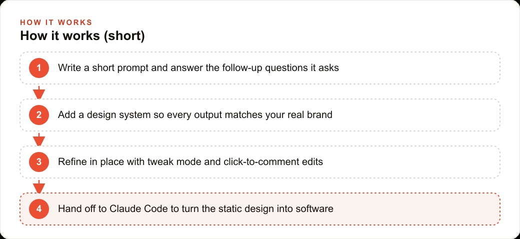
Claude Design's most consequential feature is not in the tool itself. It is the share button that initiates a handoff to Claude Code to turn the design into a working application. That handoff is where the boundary between generation and engineering becomes explicit, and understanding what lives on each side of that line tells you more about the current state of AI-assisted design than any benchmark or feature announcement.
On the Claude Design side of the line: the visual structure, the layout logic, the brand language, the information hierarchy, and the interaction patterns for the scenarios the prompt described. The output is a navigable, demonstrable artifact that communicates intent clearly enough for an engineering layer to build from.
On the Claude Code side: connecting the visual structure to real data sources, implementing conditional states for inputs that were not anticipated in the prompt, wiring the interface to backend systems, handling authentication flows, managing performance under realistic concurrent load, and testing the application against the actual edge cases that real users generate in production. None of that transfers through the share button automatically. It is specified, built, and verified on the Claude Code side of the handoff, and it requires the person directing that phase to understand what Claude Code can and cannot infer from a visual specification.
Understanding that boundary matters for anyone planning to use this workflow. The judgment required to produce a design that survives the handoff to Claude Code intact, that can be built rather than rebuilt from scratch, is the judgment of someone who understands what a visual prototype communicates and what it leaves ambiguous. That is a new design skill, not a diminished one, and it is one that most designers who understand software development will develop faster than most designers who do not.
What a designer's actual value proposition looks like after this tool ships
The designers who will be most affected by Claude Design are those whose full value was in artifact production: delivering the polished file faster than a non-designer, at lower iteration cost than hand-coding. Claude Design handles that reliably now, in hours rather than days. That part of the job has permanently changed.
The designers who will be amplified are the ones whose value was always in what preceded the file. Shaping the brief. Identifying the actual user problem rather than the stated one. Deciding which screens need to exist and what sequence they should appear in. Recognizing when a design decision makes a business problem harder rather than easier. Running the real-world test that determines whether the level-four prototype handles what actual users bring to it. Writing the prompt that makes Claude Design produce something useful rather than something that merely looks professional. Each of those activities is the same as it was before the tool existed, and each one is now the clearer differentiator between designers who create value and designers who process requests.
What Claude Design does to the profession is the same thing AutoCAD did to drafting and what Figma did to static comps: it removes the mechanical execution cost and makes the thinking visible. The tools that removed mechanical execution cost never eliminated the profession. They eliminated the practitioners for whom mechanical execution was the entire job.
---
Here is a concrete illustration of where human judgment remained load-bearing during a real Claude Design session. A team needed a 12-slide pitch deck and a branded dashboard to present to prospective partners, both within a tight timeline. Starting from a short brief, both were generated in under two hours. The deck required four iterations to reach the version that went into the meeting. The first version organized information in a sequence that was logically coherent but did not match how the intended audience typically processes a pitch: credibility and team context were positioned too late, after slides covering the problem and market opportunity that the audience needed the credibility signal to trust. That resequencing came from the person reviewing the output, not from the tool. The tool produced a polished artifact each time it received a clear instruction. The instruction about audience sequencing required judgment the tool did not supply.
The dashboard took two iterations. The first version rendered the key metric prominently but placed supporting context in a column that read right-to-left relative to the natural attention flow on the page. Moving the context to precede the metric rather than follow it was a small structural decision with a significant effect on how quickly a new viewer understood what they were looking at. Again, the judgment was external to the tool. The tool implemented the decision efficiently.
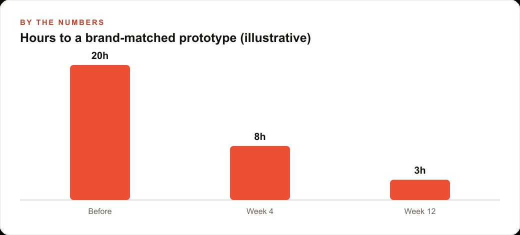
The combined two-hour output was a small fraction of the one to two weeks the same work would have taken with a freelance design engagement. The judgment that made both outputs correct rather than merely attractive was the same judgment a good designer would have brought to the brief, applied at the prompting stage rather than across a multi-day revision cycle. The speed changed. The nature of what the work requires did not.
The broader implication for anyone who commissions design work or hires designers is that the conversation about what you are actually paying for has become unavoidable. Previously, the cost of file production obscured the question of whether the strategic thinking preceding it was also being delivered. A long revision cycle could be caused by unclear briefs or by slow execution, and it was difficult to tell which was the limiting factor. Claude Design makes execution fast enough that the brief quality is now clearly the bottleneck when the output is wrong. That visibility is useful. It accelerates the process of understanding where design value actually sits in any specific engagement, and it makes it harder to confuse activity with output. A tool that removes execution friction makes it obvious when the real friction was upstream all along.
The designers who will compound their advantage over the next few years are the ones who learn to work with tools like Claude Design as amplifiers of their upstream thinking rather than replacements for it. Using the tool well means getting the brief sharper before prompting, evaluating output against the actual user problem rather than against visual polish alone, and developing a precise instinct for what the share-to-Claude-Code handoff requires in order to succeed. Those capabilities make the tool faster and more reliable on every subsequent use. That compounding is what separates a designer who becomes more productive with each generation of AI tools from one who finds each new generation more threatening.
That is exactly what we do at AI DOERS. Book a private 30-minute call with Madhuranjan Kumar and we will map the fastest path to it for your specific business.
Book your call →
Madhuranjan Kumar
Madhuranjan Kumar brings 20 years of performance-marketing experience and has managed over $200 million in Facebook ad spend for brands across the United States and beyond. His expertise spans the full modern marketing stack: Meta, Google Ads, TikTok, email automation, CRM, and the websites that hold it together. At AI DOERS he turns that track record into lead-generation systems for businesses across every industry.