
The AI Time-Horizon Chart, And What It Actually Means For Your Business
A single chart now tracks how many hours of expert human work AI can do in one sitting. Here is how I read it for real businesses, without the panic.

There is one chart in AI that unsettles people more than any benchmark score, and it is not measuring what most viewers assume. It does not track how fast a model thinks or how many words it can produce. It tracks something far more personal: how many hours of your own expert work an AI can now finish in a single sitting. I want to take that chart apart carefully, because once you understand what each part of it actually means, the panic turns into a plan.
I am Madhuranjan Kumar, and I find this chart more useful than frightening, but only if you read it correctly. Most people glance at the steep line, feel a jolt of dread, and move on. That is a waste. Let me pull the idea apart facet by facet, because the details are where the real business insight hides.
The vertical axis measures human labor, not machine speed
Start with the single most misread part of the chart, the vertical axis. It does not show how long the AI took. It shows how long the same task would take a skilled human. If an expert needs eight hours to complete a task and the AI completes it correctly, the AI is credited with eight hours of human labor replaced, even if it finished in a few minutes. Speed is not the story. Displaced human effort is.
This distinction changes how you should feel about a fast answer. A model that writes a reconciliation in ninety seconds is not impressive because it was quick. It is impressive because a competent human would have spent a day on it. The chart deliberately ignores machine speed so it can measure the thing that touches your payroll and your calendar, the quantity of expert work that no longer requires an expert to sit and do it.
The organization behind the chart built it honestly. They gathered hundreds of real tasks across engineering, coding, security, and analysis, had human experts complete them, then tested whether models could do the same work at a roughly even success rate. The line plots the length of task a model can reliably handle. For years it crept upward gently. Lately it has bent into a steep climb, and that bend is the source of the unease.
The doubling time is the number that actually matters
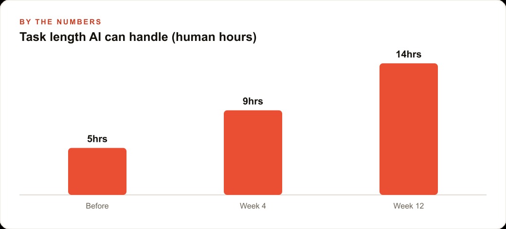
The headline figure is not any single point on the chart. It is the rate of change. Models used to roughly double the length of task they could complete every seven months. That pace alone would reshape work over a few years. But if you look only at the recent stretch, the doubling has compressed to somewhere near every four months.
Compounding at that rate is hard for the human mind to hold. A capability that doubles every four months does not grow, it detonates quietly and then all at once. The newest frontier models are landing near fourteen hours of human-equivalent work in one go, which is close to two full working days completed without a break. I have felt this personally. I handed an agent a batch of overnight work expecting it to grind until morning, and it finished everything in about four hours while I slept. Work I would have assigned a specialist for a day or two was simply done.
Long tasks quietly become permanent systems
Here is a facet the chart cannot show, and it may be the most important one for a business. Many of these long tasks are not finished and forgotten. They build something that keeps running. When I finally handed an agent a messy financial cleanup I had avoided for months, it did not just sort the numbers once. It built itself a small database and a reporting flow, so every future month now drops in and organizes itself. One long task turned into a standing system.
That is the hidden multiplier. The chart measures a one-time completion, but the real payoff is that the completion often leaves infrastructure behind. You do not get a single day of work back. You get that day back every month for as long as the system runs. When you evaluate what an agent can do for you, do not only ask how many hours it saves today. Ask whether the task, once done, keeps paying you back.
Uncertainty in the size, clarity in the direction
Now for the honest facet, the one the alarmists skip. Every point on the chart is a range, not a fixed truth. The measurements carry wide error bars, and the success rate we are often discussing is near half, not perfection. So the correct posture is not to fire your team and trust a machine blindly. It is to find the heavy, repeatable work, let an agent take a full first pass, and keep a human checking the direction of travel.
What is not in dispute is that direction. Even skeptics have stopped claiming the trend is fake. The debate has moved from whether this changes work to how fast it reaches any given desk. Uncertain in magnitude, unambiguous in slope, that is the honest read, and it is exactly why quiet preparation beats both denial and panic.
Adoption is a confidence curve, not just a capability curve
One more subtle facet. As people use these tools more, they let them run longer, even on the same model. Trust, not raw capability, often sets how much work you actually hand over. The research shows that the people who let agents run longest are also the ones who interrupt them most, stepping in the instant something drifts. Long autonomy and close supervision go together. That is the mature way to work with a capability that is powerful but not perfect.
Reading the chart onto a real desk
Let me ground all of this in an illustrative example. Picture an independent insurance agency that spends hours each week pulling quotes from several carriers, comparing coverage line by line, and writing plain-language renewal summaries for clients. That is precisely the multi-step, detail-heavy work the chart is about, the kind you can only face when your mind is fresh.
I would point an agent at the agency's intake form and carrier rate sheets and have it assemble side-by-side comparisons with the coverage gaps flagged, then draft the client-facing renewal note in the agency's own voice. Illustratively, a producer who lost a full morning, call it four hours, to carrier comparisons each week now reviews a tidy draft in twenty minutes. During that first cleanup, the agent learns where the data lives and builds a simple structure to hold it, so every future renewal flows through the same path automatically. That is the long-task-becomes-a-system effect landing on a real workflow.
The payoff is not only reclaimed hours, it is reclaimed attention. The producer spends the freed morning on relationships and new business, the work no machine replaces, and the agency quietly handles more policies without adding headcount. Those freed hours often flow straight into demand generation, sharper Facebook and Instagram ad campaigns and better follow-up inside the CRM and website stack, which is where the saved time turns back into revenue. The detail-heavy grind moves to the agent, the judgment and the client trust stay with the human.
The tasks the chart quietly makes optional
Step back from the mechanics and consider which category of work the chart is really coming for, because it reframes how you should plan. The tasks that push the line upward are not the creative, relational, or strategic parts of a business. They are the long, detailed, procedural ones: reconciliations, multi-step research, data cleanup, drafting from a template, comparing options line by line. These are the jobs that demand a fresh mind and a clear afternoon, the ones you postpone precisely because they are heavy and joyless.
That is a hopeful reading, not a grim one. The chart is telling you that the hours you have been trading your best energy for are now compressible. You are no longer trapped spending your sharpest morning on tedium a capable assistant could carry. The work that remains stubbornly human, judgment, taste, trust, the decision about what should happen and why, is the work most people actually want to be doing anyway. The chart is not erasing your job. It is threatening the part of your job you already dislike.
But this is also where the honesty of the error bars earns its keep. Because each point is a range and the success rate is often near half rather than perfect, the correct move is never to hand over a long task and disappear. It is to let the agent take a full first pass, then apply your judgment to the result. The chart measures how much work an agent can attempt at a given success rate, not how much work you can safely ignore. Those are different numbers, and confusing them is how people get burned.
The practical shape of that discipline is a division of labor you can plan around now. Route the heavy, repeatable, procedural tasks to agents and keep a human on the direction and the final call. Reinvest the reclaimed hours into the work that compounds, the relationships and the demand generation, so the freed capacity flows into Google Ads management, content, and follow-up rather than simply evaporating. The businesses that read the chart well will not be the ones that automated the most. They will be the ones that automated the right layer and moved their people up to the work no line on a chart can ever climb into.
It also helps to remember that the chart is a description of a trend, not a countdown to a specific date on your calendar. Its value is not in telling you exactly when an agent will handle a two-day task in your particular industry. Its value is in settling the argument about direction so you can stop debating whether to prepare and start deciding how. Treat it the way a sailor treats a rising tide, not as a threat to outrun but as a change in conditions to use. The owners who thrive will not be the ones who predicted the exact slope. They will be the ones who, seeing the slope was undeniable, quietly built the habit of handing heavy tasks to agents and checking the results, so that whatever the precise pace turns out to be, they are already fluent in the workflow by the time it reaches their desk.
Turning the chart into a personal plan
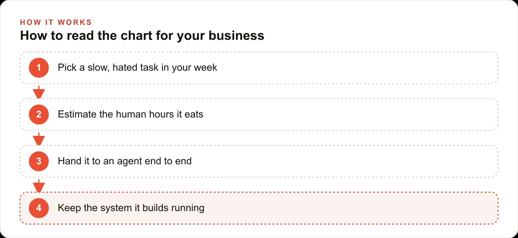
So how do you actually use this instead of dreading it? Start small and concrete. Pick one task you keep pushing to next week, the kind that feels too hairy to begin. Estimate roughly how many human hours it eats, because that number is your before figure and the whole chart is built on exactly that measurement. Export the raw inputs, hand them to an agent with clear instructions, and watch the first pass closely.
When it produces something useful, ask it to capture the steps as a reusable flow so the next round is faster, and so a one-time task starts leaving a system behind. Then build trust the way real users do: let the agent run a little longer each time, interrupt it when it heads the wrong way, and keep a human signoff on anything that touches money or clients. The same discipline applies whether the freed capacity goes into Google Ads management, content for SEO and organic search, or simply into the parts of the business you actually enjoy.
The direction of the chart is settled. The only open questions are how fast it reaches your corner of work and how ready you are when it does. You can wire this up yourself with patience and a few evenings of trial and error, or you can bring in someone who has already built these flows and skip the painful part of the learning curve.
That is exactly what we do at AI DOERS. Book a private 30-minute call with Madhuranjan Kumar and we will map the fastest path to it for your specific business.
Book your call →
Madhuranjan Kumar
Madhuranjan Kumar brings 20 years of performance-marketing experience and has managed over $200 million in Facebook ad spend for brands across the United States and beyond. His expertise spans the full modern marketing stack: Meta, Google Ads, TikTok, email automation, CRM, and the websites that hold it together. At AI DOERS he turns that track record into lead-generation systems for businesses across every industry.