
10x Better UI From AI: Use A Design Model Inside Your Editor
AI writes working code, but the look often falls flat. Here is a workflow that wires a design focused model into your editor to set beautiful screens, then hands off to a general model that keeps the same style.

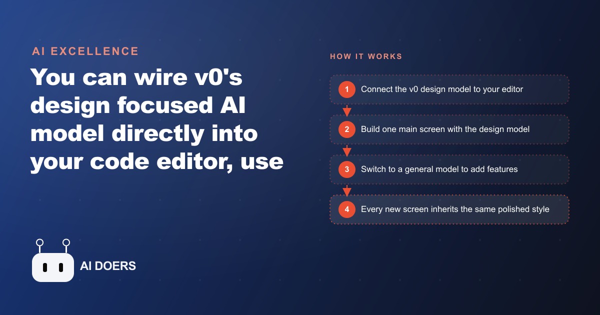
Three days of UI work per feature compressed to four hours. The visual gap between "it works but looks flat" and "this looks like a real product" closed without a design agency, a new hire, or a longer project scope. Here are eight things that changed in how I use AI in a code editor after wiring in a dedicated design model alongside the general coding model I was already using.
General coding models build working apps and visually flat ones
If you have spent time generating UI code with a general-purpose AI model, you know the pattern. The button works. The form submits. The data loads and displays correctly. But the spacing feels slightly off, the font choices are functional rather than deliberate, the color palette is safe to the point of being characterless, and the overall result looks like a competent prototype rather than something you would put in front of a paying user.
This is not a failure of the general coding model. It is doing what it was trained to do, which is write correct, working code. Visual design judgment is a different capability from syntactic correctness and functional logic. A model trained primarily on code repositories has absorbed the patterns that make interfaces work. It has not necessarily absorbed the subtler patterns that make them feel polished, the precise spacing that makes a layout breathe, the typographic hierarchy that guides a user's eye, the color relationships that feel considered rather than arbitrary.
The result is that a general coding model can produce a complete, functional application quickly, and that application will often have a visual quality that reads as AI-generated in a way that is hard to articulate but easy to recognize. The margins are slightly too generous or too tight. The typography hierarchy is present but not particularly intentional. The interactive states are functional but do not reward the interaction. The design does not feel like a decision was made. It feels like a default was accepted.
For internal tools where the people using it care only about the function, that visual quality is acceptable. For anything that touches clients, or that needs to communicate professionalism to a user who did not commission the product, the flat quality matters. It is the difference between a tool that works and a product that people trust when they first open it.
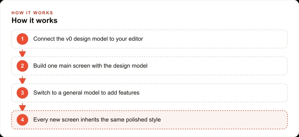
The v0 design model is brilliant at one screen and poor at an entire project
The v0 model, purpose-built for UI generation with strong visual design judgment, produces visually compelling output on a focused, single-screen task. Ask it to design a dashboard view, a landing page, a settings panel, or a data entry form, and the result has the qualities the general coding model tends to miss: intentional spacing, deliberate typography choices, a coherent color system, and interactive states that feel considered rather than defaulted.
Ask it to scaffold an entire application, including routing, state management, data fetching, authentication, error handling, and multiple interconnected views, and the result becomes less reliable. The model's strength is visual composition within a defined scope. When the scope expands to include all the structural decisions a full application requires, the design quality holds but the structural decisions get less consistent, and the output requires more correction to turn into a working codebase.
This is the insight that made the two-model workflow worth adopting for me. The v0 model is not a replacement for the general coding model. It is a specialist with a narrow, deep strength. Using it for the thing it is best at, designing individual screens with intention, and not using it for the things it is not built for, scaffolding full application architecture, is how you extract the value without running into its limits.
The practical implication is that design decisions and engineering decisions should be handled by different models. Those two categories of decision are separable in a well-structured project. Keeping them separated is what allows each model to operate within its area of competence and produce output that is genuinely better than what either model would produce if asked to do everything.
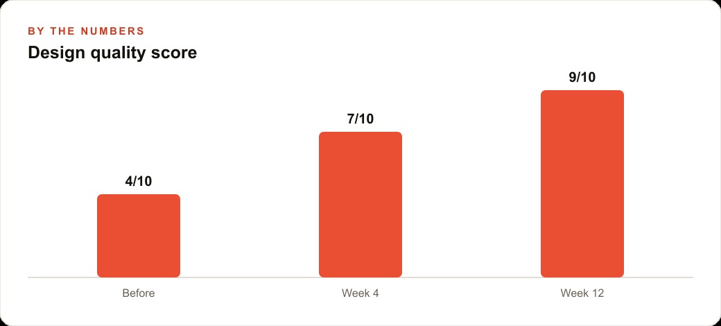
One polished screen sets the visual contract that every later screen inherits
The insight that changed the most about how I approach a new project is this: you do not need every screen to be designed by the design model. You need one screen to be designed well enough that every other screen can inherit from it.
When the first screen of a project is built with the design model, the choices it makes become the implicit contract for everything that follows. The component library it chooses or creates, the spacing system it establishes, the color palette it applies, the typography scale it sets, and the interactive state patterns it introduces are all absorbed as context by the general model when it builds subsequent screens. When the general coding model builds the second screen with the first screen visible in the context, it produces output that is stylistically consistent with the established foundation.
This inheritance effect does not happen automatically if the first screen is built casually. It requires that the first screen be genuinely polished, with explicit enough component definitions and style choices that the general model can read them as a design system rather than incidental code. A first screen that uses inline styles with specific values that happen to look good does not produce the same inheritance as one that defines a small set of utility classes with clear naming conventions corresponding to the visual choices made.
For a solo SaaS founder building a project management tool, the investment in the first screen translates directly into the quality of every screen that follows. The first screen, built using the design model in a focused four-hour session, produced a clean dashboard view with defined components, a clear color system, and readable typography at multiple scales. Every subsequent screen, built by the general model with the first screen as context, arrived at a visual quality baseline that matched the first screen's level of intention. Without the design model foundation, the second and third screens drifted visually from the first in small but cumulative ways that made the product look unfinished by screen five.
Switching models mid-project is not a bug in the workflow; it is the workflow
When I first started using the two-model approach, the model-switching felt like a workaround for a limitation. Use the design model where the general model is weak. Switch to the general model where the design model is weak. That framing treats the switching as friction.
The more accurate framing is that model-switching is the workflow itself. Different tools for different jobs is not a workaround. It is normal professional practice applied to AI. A carpenter uses a different tool to cut a board than to join two boards. The switch between tools is not a sign that neither tool is adequate. It is a sign that the carpenter understands what each tool is for.
The design model and the general coding model have different strengths, and those strengths map cleanly onto different phases of any product build. The design model's phase is early, when the visual language is being established and when the choices made will propagate through the rest of the build. The general model's phase is ongoing, when features are being added, logic is being implemented, and the structure of the application is growing around the established visual foundation.
Understanding that structure makes model-switching deliberate rather than reactive. You do not switch to the general model when the design model struggles with something structural. You switch to the general model as a planned step in the workflow, after the design foundation is set and documented, knowing that the switch is the right next step in the process rather than a retreat from a limitation.
The deliberate version of this workflow produces consistently better results than the reactive version. When the switch is planned, the transition is clean: the design work is complete, the components are defined, the style system is documented, and the general model receives that documentation as context. When the switch is reactive, the transition is messy: the design model left the codebase in a partially structured state, the general model fills in the structure with its own defaults, and the visual consistency that was the whole point of using the design model begins to erode.
The API key toggle is the most overlooked step and the one that breaks the most sessions
The mechanics of using a design model like v0 inside a code editor require pointing the editor's model configuration at a different API base URL and a different API key than the one used for the general model. The design model uses a separate endpoint with separate authentication.
The toggle itself is simple. Change the base URL in the editor settings. Change the API key. The design model is active. Reverse those two changes and the general model is active again. In practice, this step fails often enough to deserve explicit attention in the workflow.
The most common failure mode is leaving the design model's API key active while trying to use the general model. The editor sends a request to the general model endpoint with the design model's authentication credentials. The result is either an authentication error that stops the session, or depending on how the editor handles the mismatch, a silent fallback to a degraded mode where the output is unexpected and the reason is not obvious from what the editor shows. Debugging this without knowing about the key toggle takes significantly longer than necessary.
The fix is a deliberate checklist step at the start of every session and at every model switch. Before sending a prompt, confirm which key is currently active and which endpoint the editor is pointed at. The check takes five seconds and it prevents the most common session failure in the two-model workflow.
For the solo SaaS founder building the project management tool, three early sessions were lost to confusion about the active model before the checklist habit was established. After the habit was in place, that failure mode disappeared entirely. The checklist is not sophisticated. It is a single line in a sticky note visible during every session: "Check active model before switching tasks."
Context in the chat thread gives the design model better instructions than a prompt alone
The design model produces better output when it has context about the project beyond the immediate request. A prompt that says "design a settings page" produces a competent result. A prompt that says "design a settings page consistent with the dashboard we already built, using the same component structure, typography, and color system, for a project management tool used by small teams of three to ten people" produces a result that is immediately consistent with the existing design and requires minimal adjustment.
The most efficient mechanism for providing that context is the conversation thread history. When the design model's session includes the conversation in which the first screen was built, it has access to the specific choices made, the components defined, the reasoning applied, and the client feedback incorporated. New requests made within that session context receive responses that treat the existing decisions as constraints rather than as starting points for fresh choices.
When a new session starts without that history, the design model starts fresh. The result may be high quality in isolation but inconsistent with the existing design. Providing context explicitly in the new session's opening prompt, by describing the established color system with specific values, the typography scale, the component names, and the spacing conventions, recovers most of the inheritance effect without needing the full conversation history.
The practical habit that makes this sustainable is maintaining a short design specification document updated as the first screen is built. The document captures: the color palette with specific hex values, the typography scale with sizes and weights, the spacing system with the key values used, the names and structures of the core components, and any interaction patterns established. That document becomes the context block pasted at the start of any new design model session, ensuring consistency across every session that follows without requiring access to previous conversation history.
Returning to the design model is faster than redesigning when you need a fresh look
One of the less obvious benefits of the two-model approach is what happens when a design decision made early in the project turns out to be wrong over time. The color palette reads too corporate at mobile sizes. The typography choice that worked for the dashboard does not work for the data-dense reporting view. A core component pattern that made sense for the first three screens does not generalize well to the fourth.
The instinct when that happens is to fix it in the general coding model, since that is the model currently active in the project. That instinct produces incremental fixes that address the specific symptom rather than the underlying design decision. The result is a codebase with inconsistent styling: the first three screens using the original pattern, the fourth screen using a patch, the fifth screen using a slightly different patch based on a different fix, and no single authoritative version of the design language anywhere in the codebase.
The faster approach is to return to the design model and revise the decision at the component level rather than patching the symptom at the implementation level. Bring the design model back into an active session, describe specifically what is not working and why, and ask it to produce a revised version of the problematic component or style decision. That revised version becomes the new baseline. The general model then propagates the revision through the existing screens that need it.
This approach produces a codebase with a consistent, revised design language rather than a patched one. The maintenance cost of a design system with one authoritative version is significantly lower than one with a history of symptom-level patches, and returning to the design model to make the revision is consistently faster than iterating toward a coherent result through the general model, which tends to produce solutions that are locally correct but globally inconsistent.
The first output from either model is a starting point, not a finished product
The most important mental adjustment in working with both models is treating their first output as the opening position in a conversation rather than the final deliverable. This is true of the general coding model producing functional code and equally true of the design model producing visual layouts.
The design model's first output establishes a direction. It makes specific choices about color, spacing, typography, and component structure. Some of those choices will be exactly right for the project. Some will need adjustment. The process of reviewing the first output and identifying what to keep, what to adjust, and what to replace is faster and more productive than trying to specify every detail in the initial prompt.
The specific value of the first output, even when it needs adjustment, is that it makes the decision space concrete. A prompt describes what you want abstractly. The first output makes a set of choices you can react to specifically. "The background is slightly too dark for the amount of text we need to display" is a more precise instruction than "make the background lighter." "The spacing between cards is too tight on the mobile breakpoint" is a more actionable note than "optimize the mobile layout." Reacting to concrete choices is faster than specifying abstract preferences.
The result after two or three rounds of response and adjustment is a screen that reflects the project's actual requirements with a precision that no initial prompt could have achieved, produced faster than any manual design process would have. For the solo SaaS founder who previously spent three days per feature on UI work at a freelance designer rate of $500 per day, that is $1,500 in avoided cost per feature, and two and a half days recovered per feature, compounded across every feature in the roadmap. The two-model workflow did not eliminate the need for design judgment. It made design judgment faster to execute, cheaper to revisit, and consistent enough to accumulate into a product that feels intentional rather than assembled.
That is exactly what we do at AI DOERS. Book a private 30-minute call with Madhuranjan Kumar and we will map the fastest path to it for your specific business.
Book your call →
Madhuranjan Kumar
Madhuranjan Kumar brings 20 years of performance-marketing experience and has managed over $200 million in Facebook ad spend for brands across the United States and beyond. His expertise spans the full modern marketing stack: Meta, Google Ads, TikTok, email automation, CRM, and the websites that hold it together. At AI DOERS he turns that track record into lead-generation systems for businesses across every industry.